
Sol Purpose
An identity finally as serious as the work.
Sol Purpose Development Company
2026
Brand Identity, Visual Language, Print & Collateral, Digital
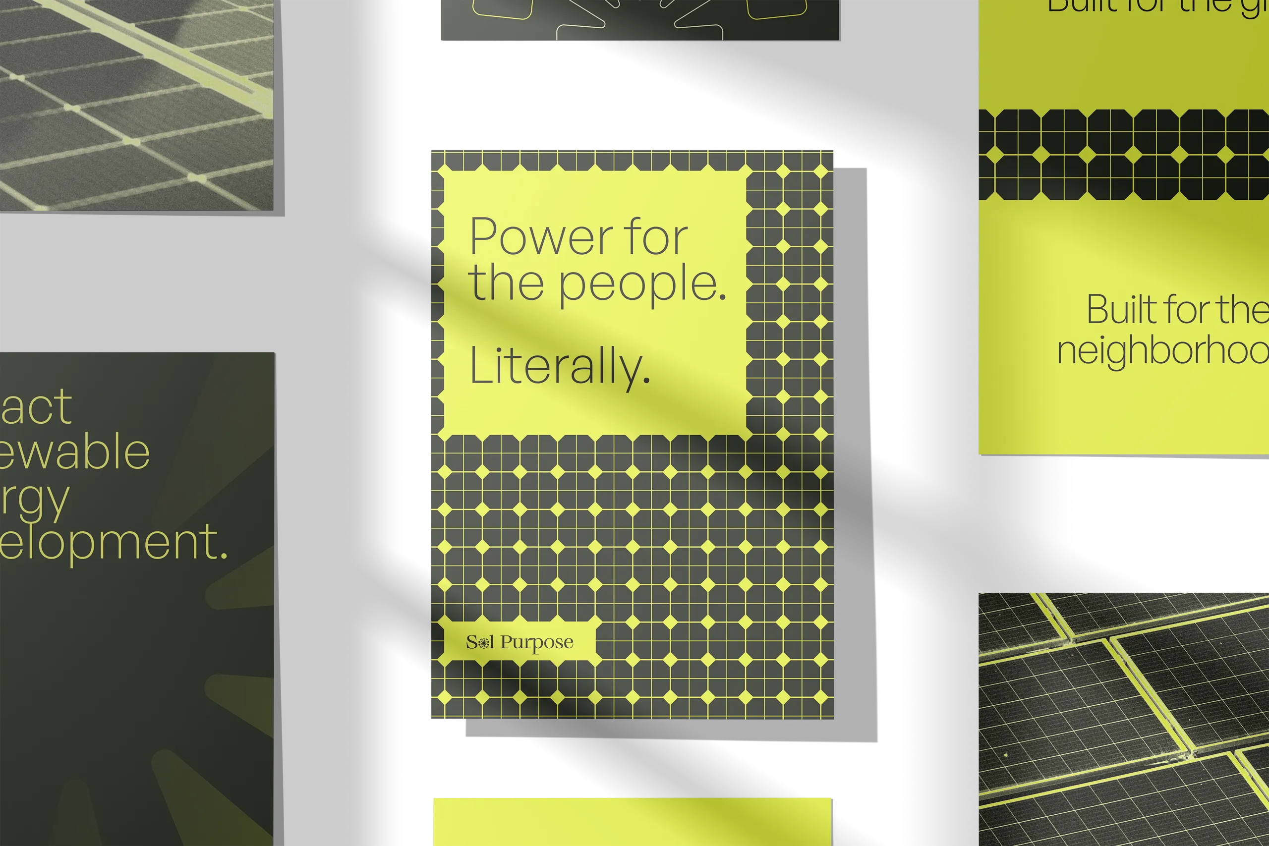
Solar power with conviction.
Sol Purpose operates at the intersection of renewable energy and genuine community impact by developing community solar projects for public housing and underserved communities. All of this at a scale nobody else has attempted. They've built the largest community solar public housing projects in the world. The rebrand needed to match that ambition without retreating into the safe, sanitized visual language that defines most of the clean energy space.
Sol Purpose Development Company accelerates renewable energy access, channels private funding into public benefit, and creates job training opportunities for low-to-moderate income communities. Their model is scalable. Their results are real. Their brand needed to say so.
The lockup
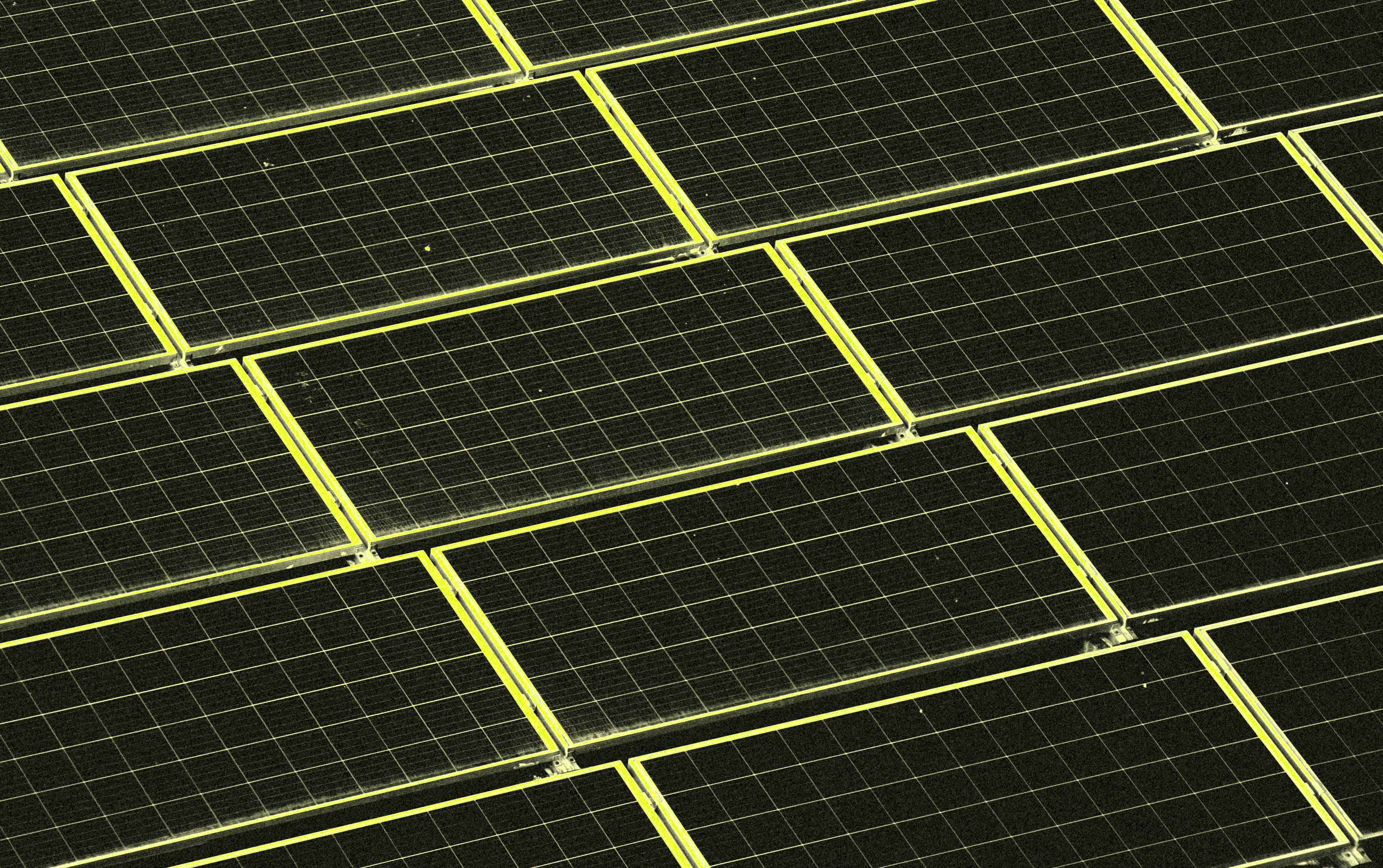
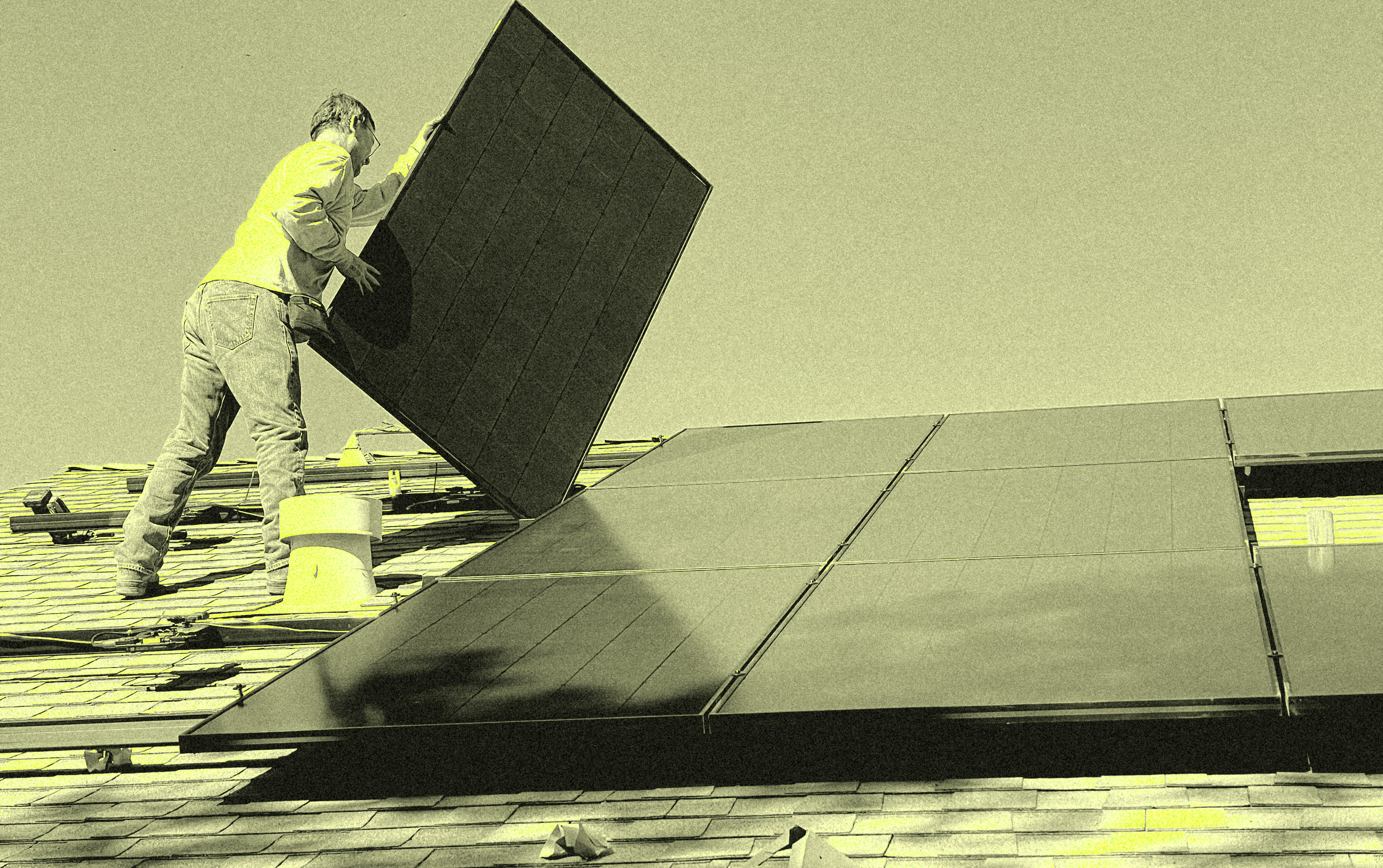
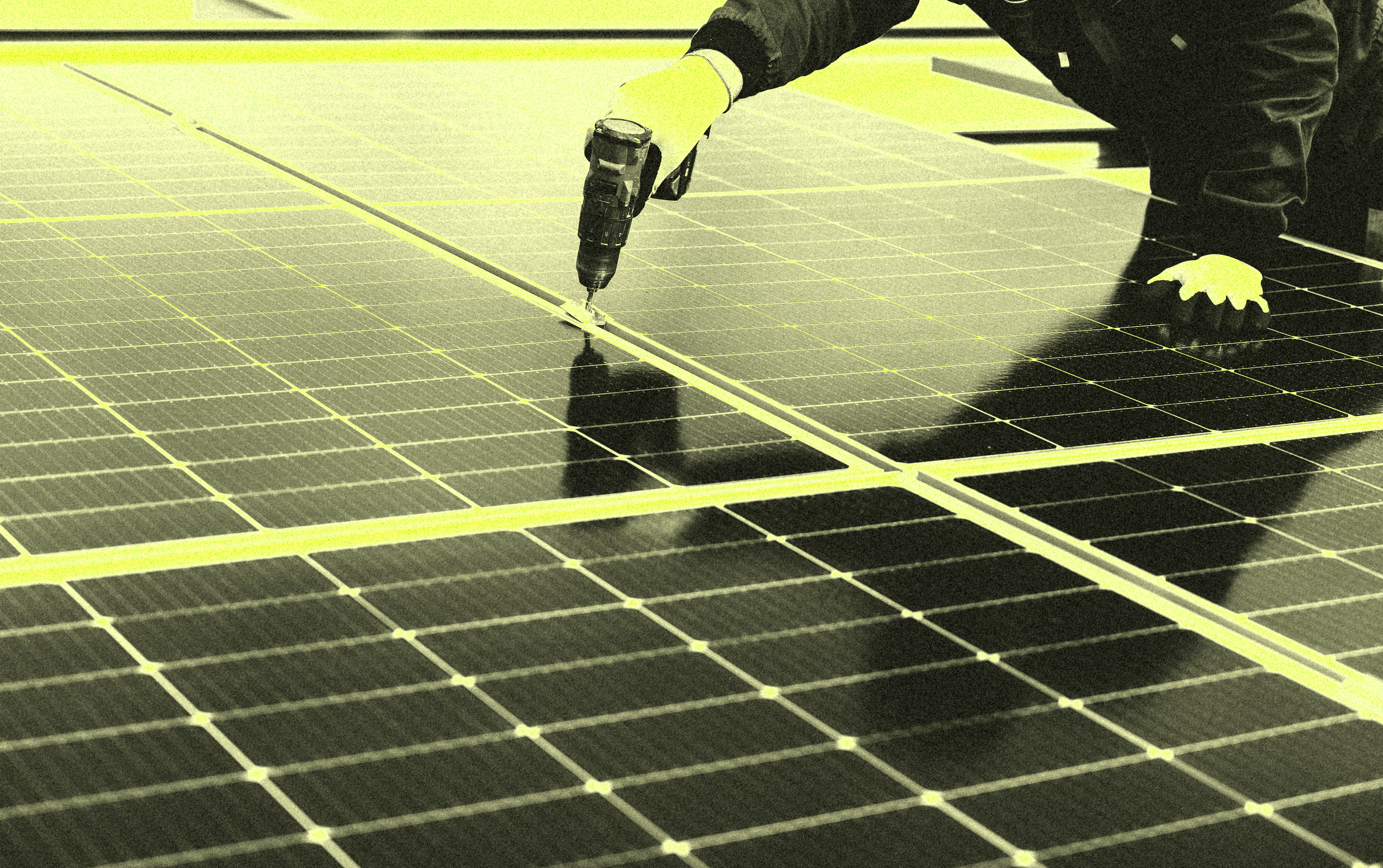
The photo treatment pushes that further.
Rather than defaulting to aspirational aerial photography, the imagery is processed into something almost graphic. Pushing the images to high constrast makes the geometry of the panels stand out in sharp relief against near-black. It gives the work a sense of scale and intensity that feels earned.
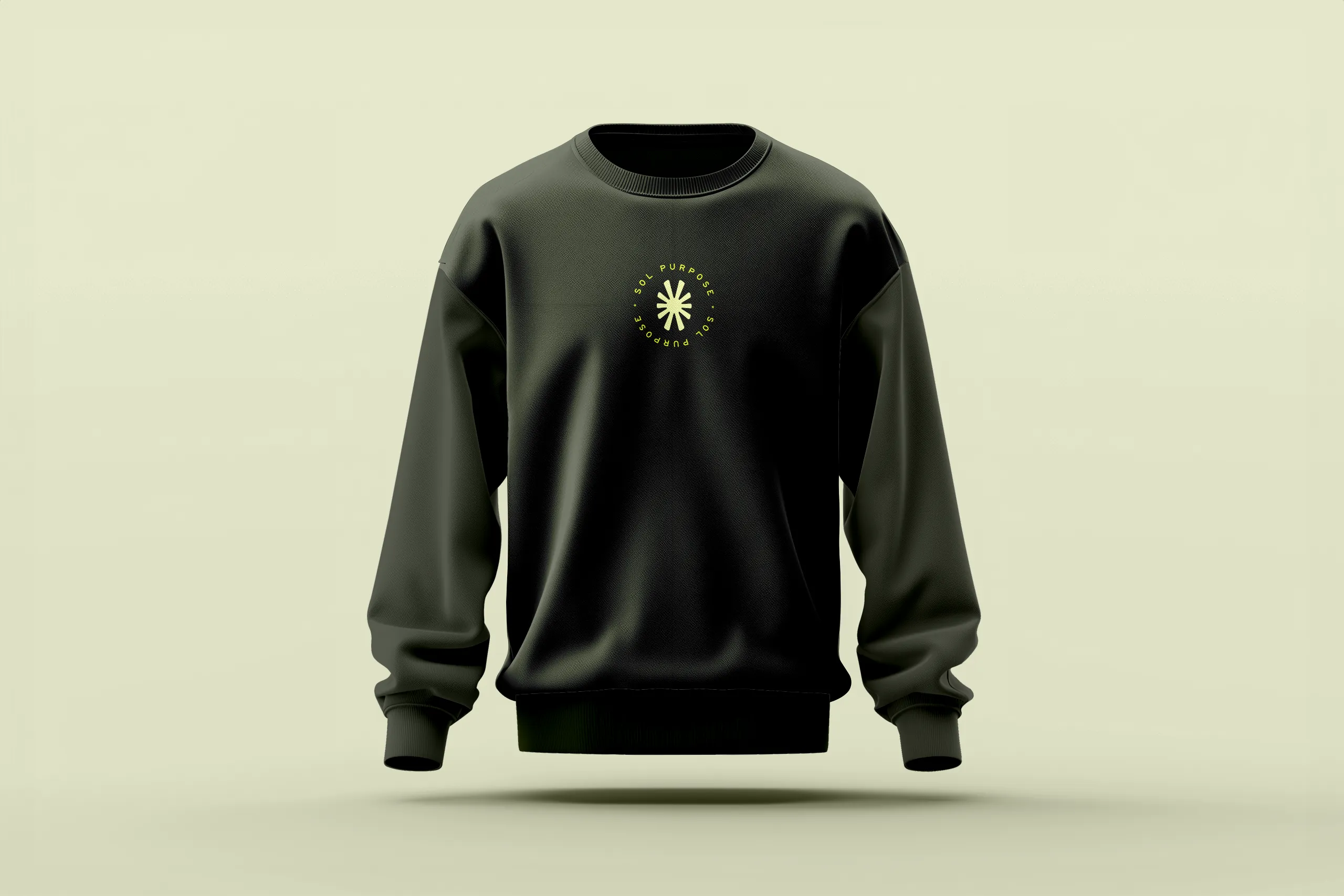
Worn with conviction.
An identity this strong doesn't stop at the screen. You know they had to get some rad merch.
Brand to screen.
Their web presence was one of the first pieces to be built out, as that's where they will often send people. So we chose a focused, high-impact entry point that was highly memorable.
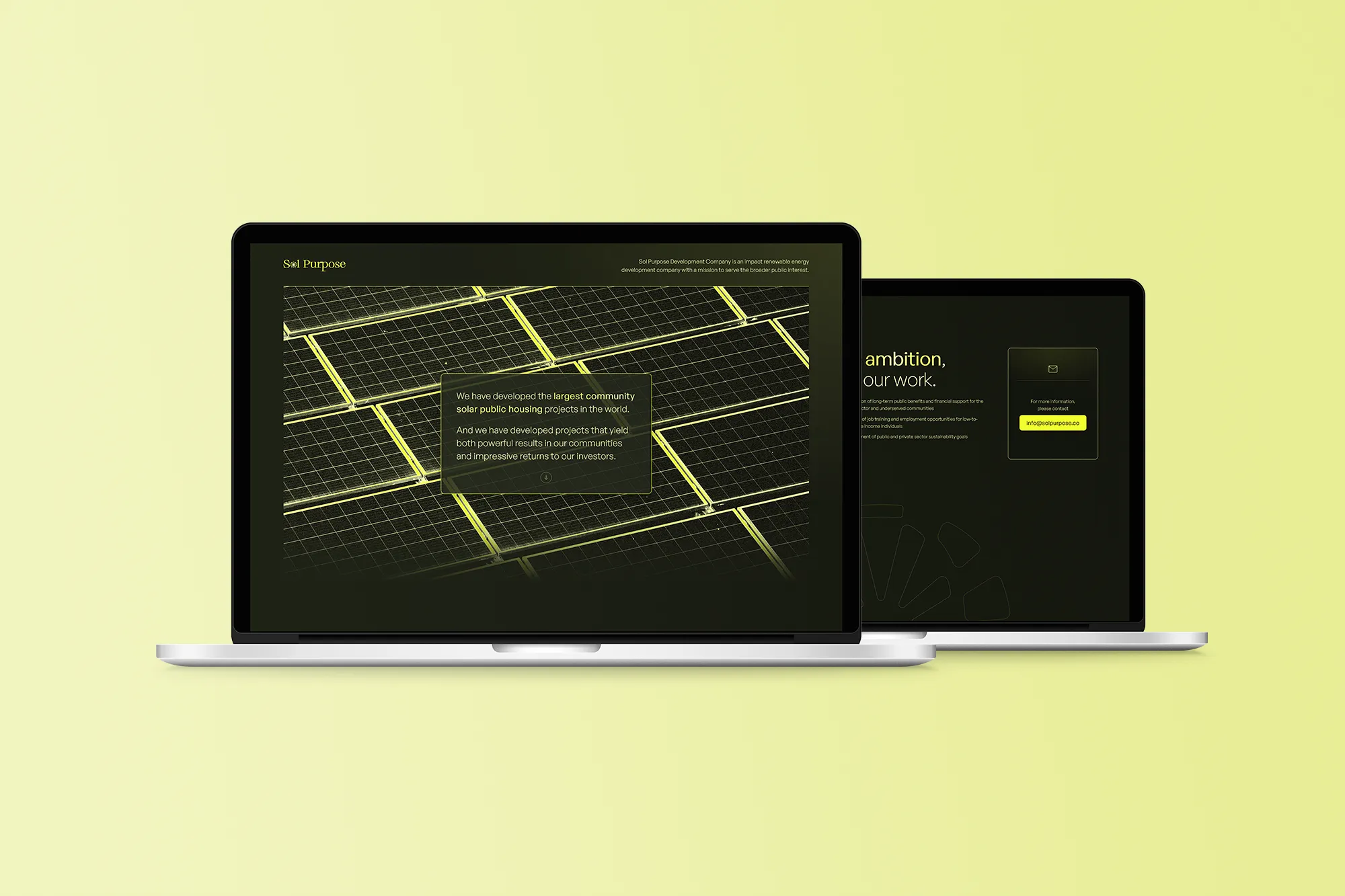
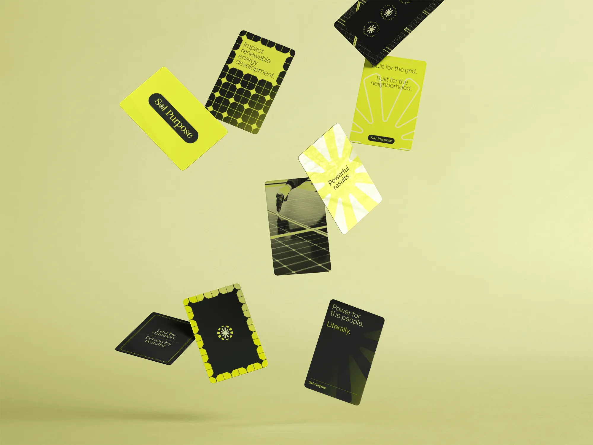
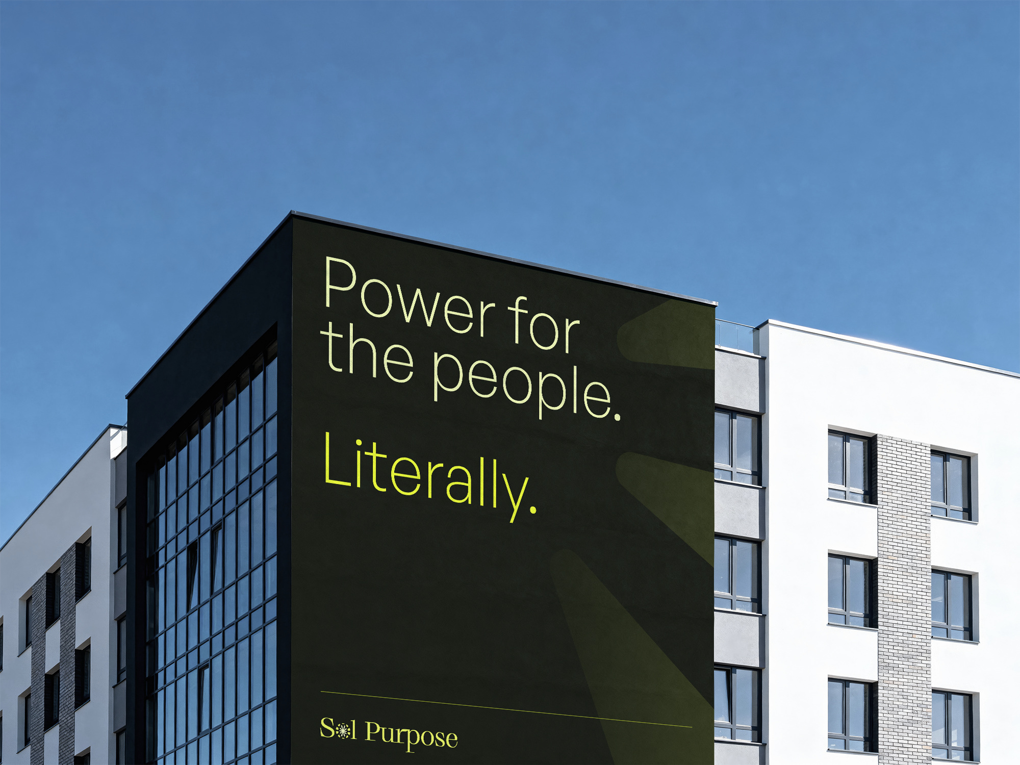
The palette makes an immediate statement: a deep forest green anchors everything, with an electric acid yellow that cuts through it with real force. It's a combination that suggests both growth and voltage—organic and industrial at once. Where most impact-driven energy brands reach for sky blues and optimistic whites, this one feels more like a conviction than a tagline.
The logo ties it together: a classic serif wordmark with the 'o' in Sol replaced by a radiating sun mark that reads as both celestial and industrial. Subtle enough to feel refined, distinctive enough to stick. For an organization doing work this serious, the identity finally looks the part.