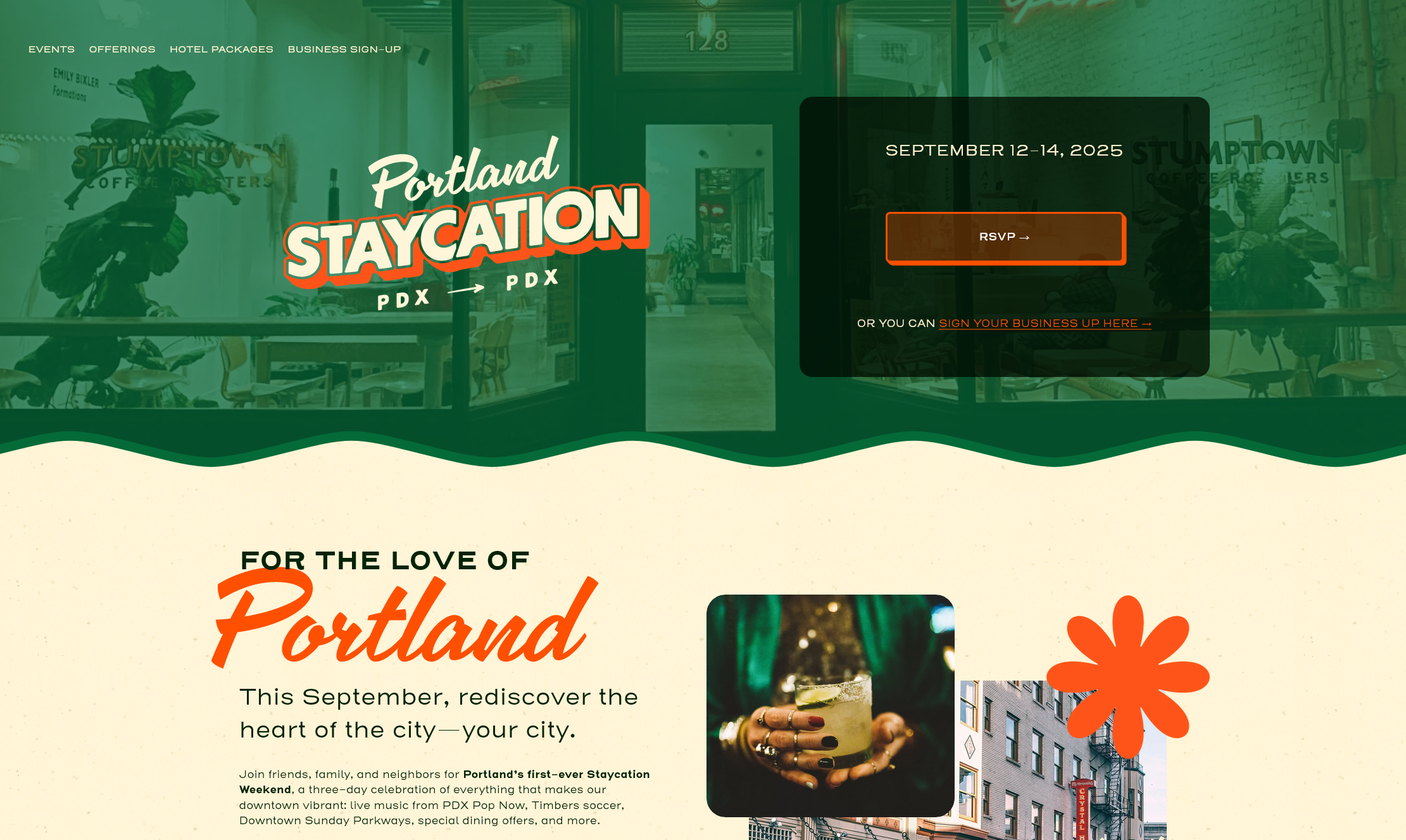
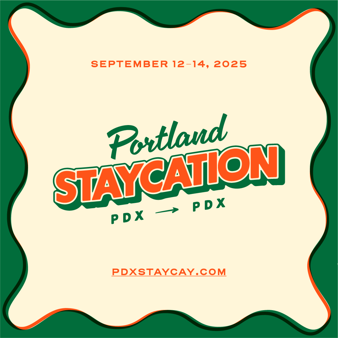
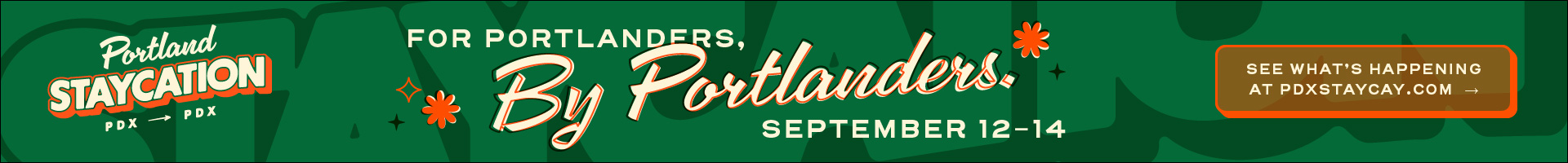
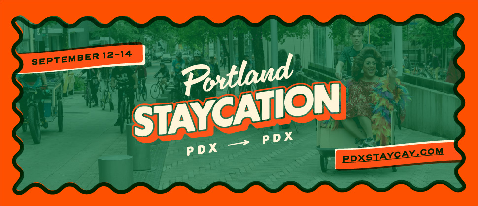
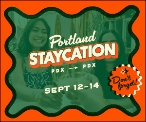
Portland Staycation
Turning a city into a destination for the people who already live here.
Reimagine Portland × Portland Bureau of Transportation
2025
Brand Identity, Campaign Design, Print & Collateral, Digital Advertising, Merchandise, Web Design
The brief
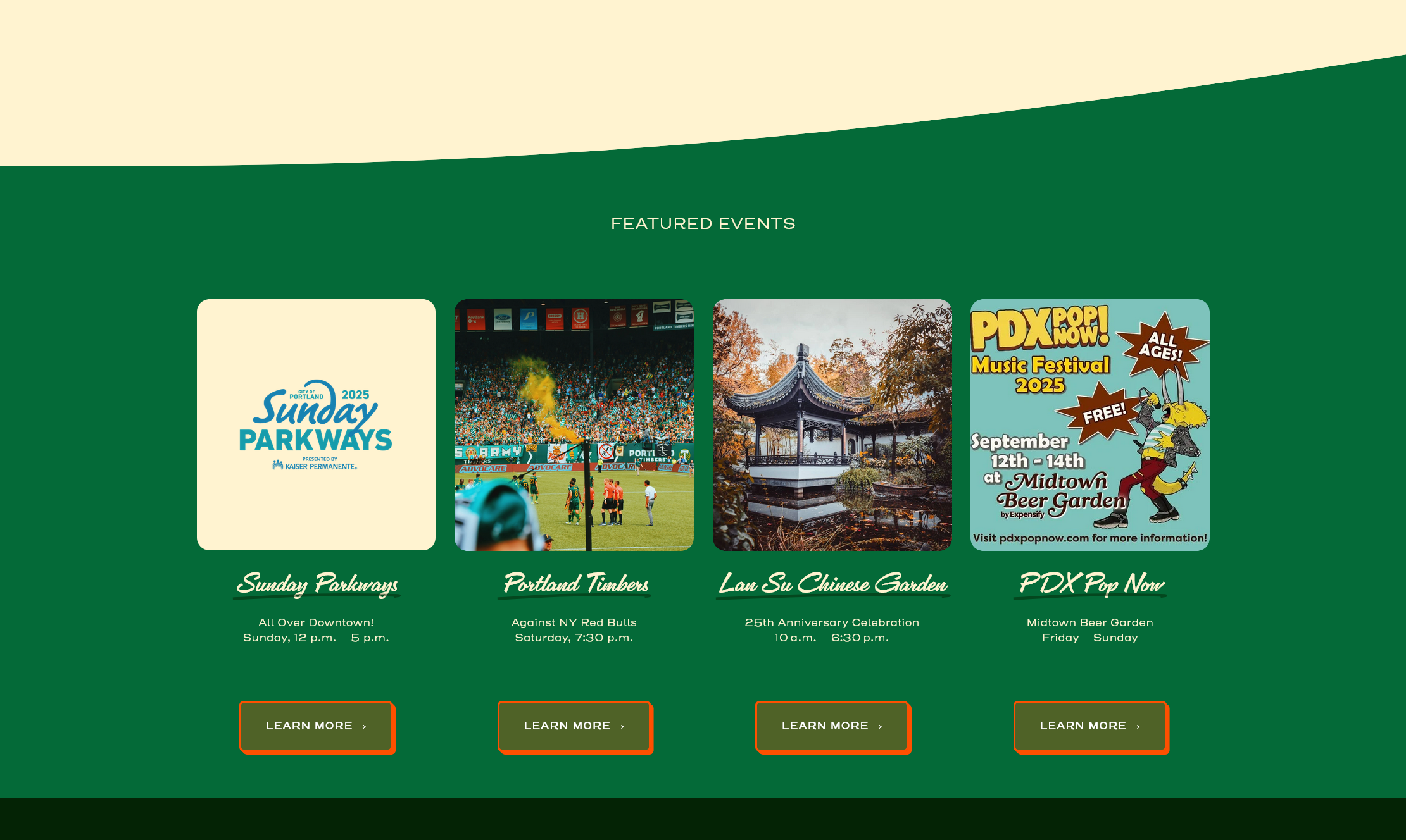
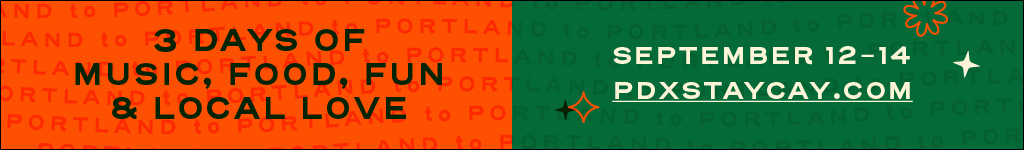
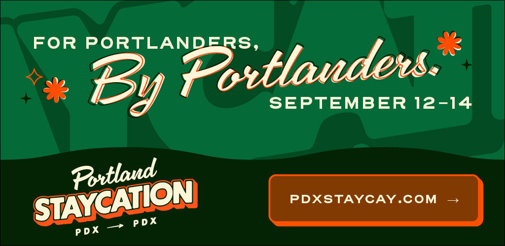
It started with a coincidence. Multiple big ticket events were landing on the same weekend, and someone asked the question: what if we turned it into a three-day celebration of everything downtown Portland has to offer? Reimagine Portland and the Portland Bureau of Transportation asked us to build a brand they could use to shop the idea around. Then it snowballed. Downtown Portland, Portland Alliance, Sunday Parkways, Travel Portland, Travel Oregon, Alaska Airlines, Prosper Portland, and more jumped in with both financial and structural backing.
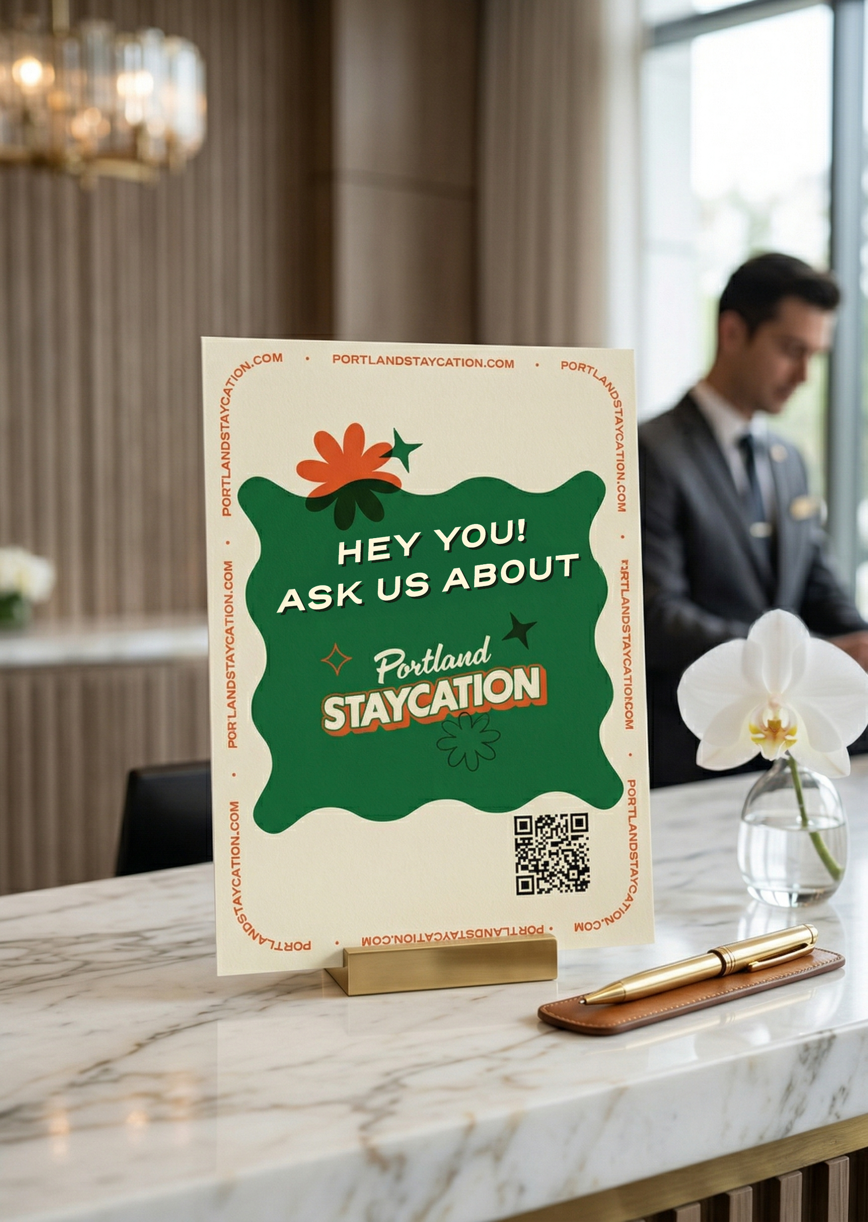
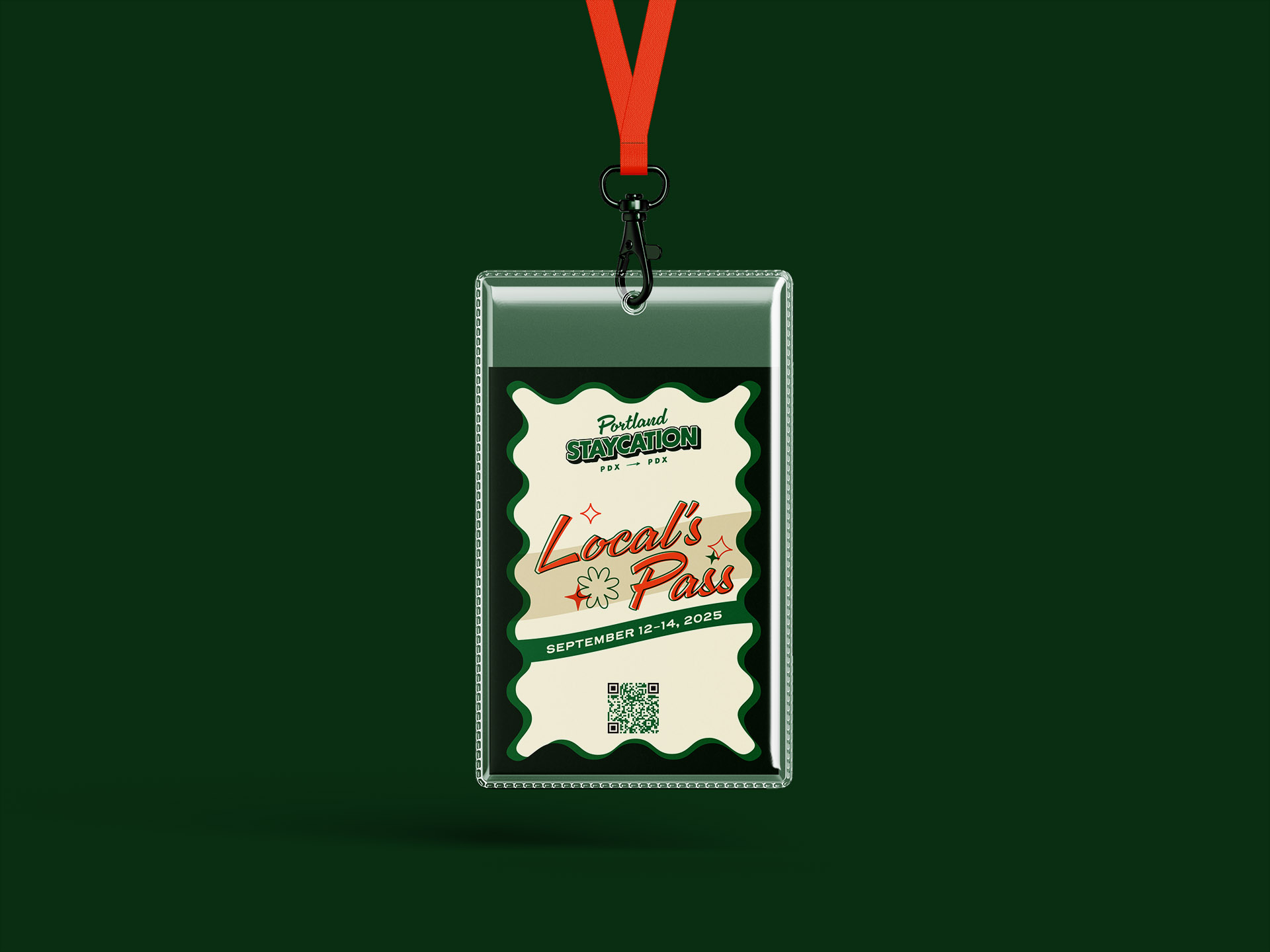
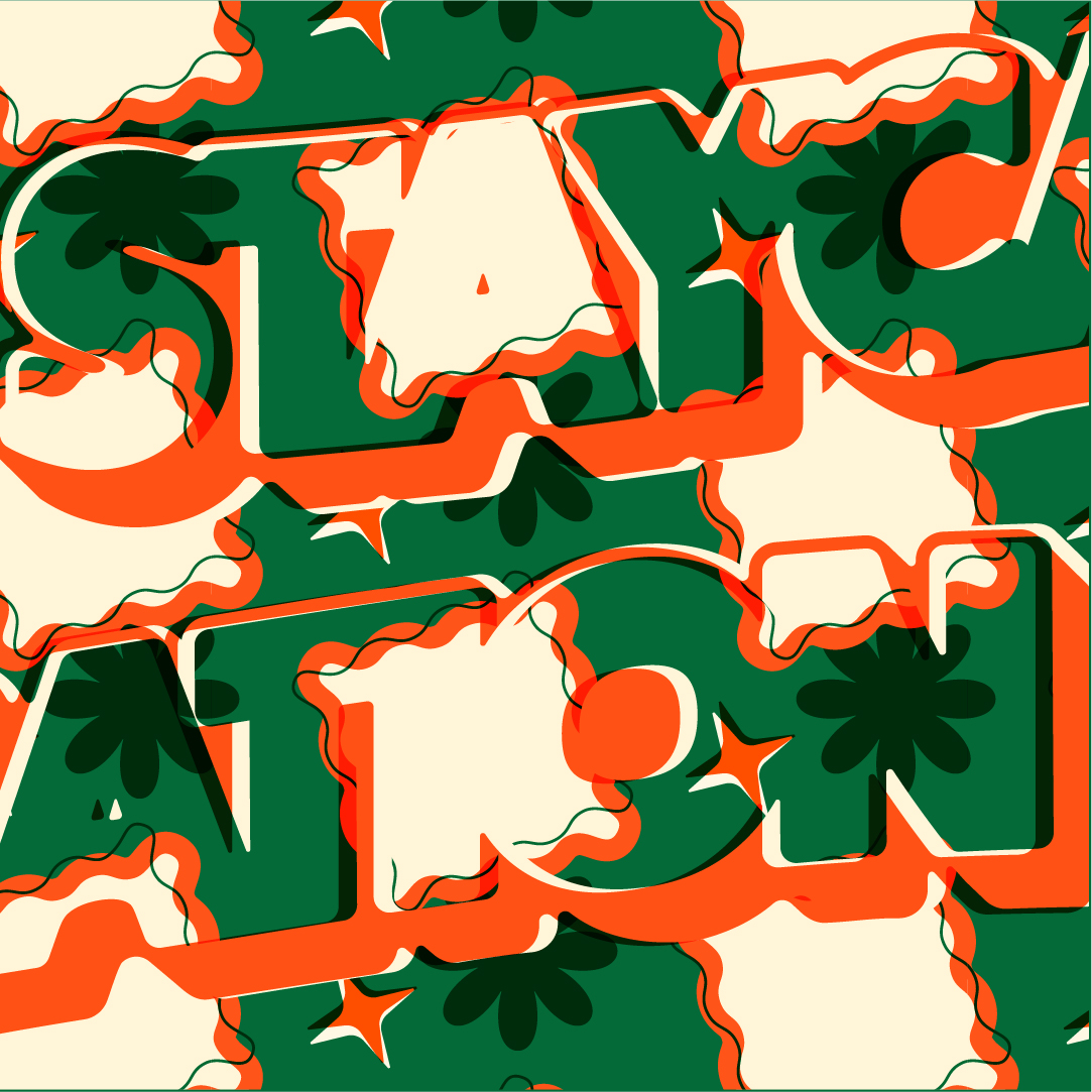
Built by hand
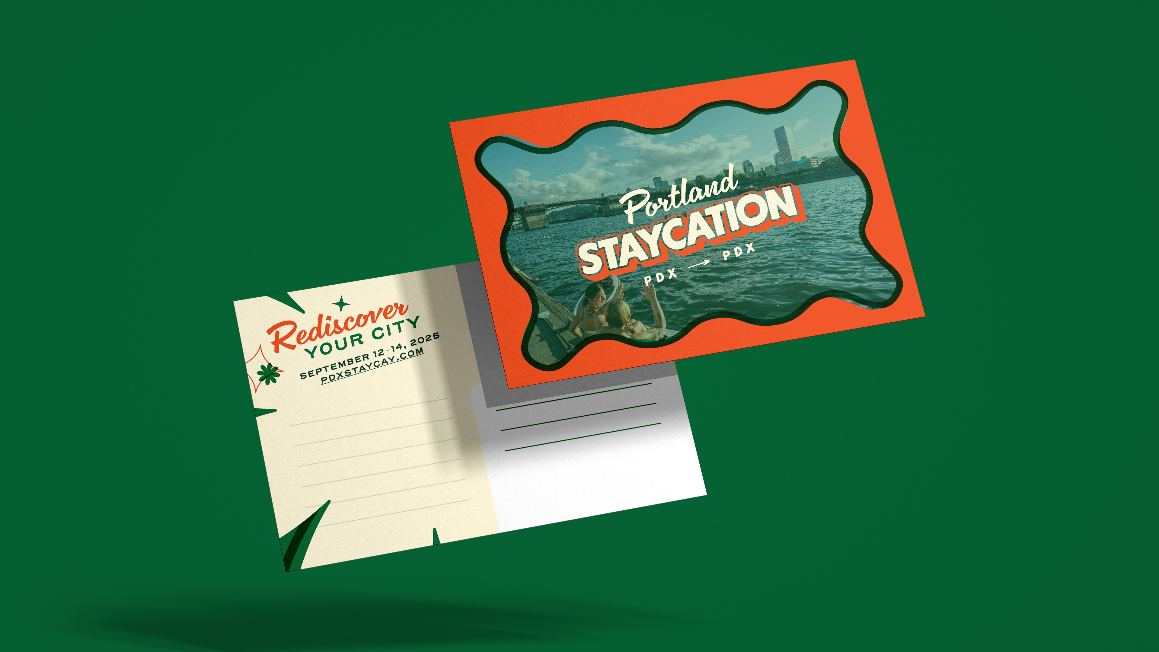
Souvenir-worthy
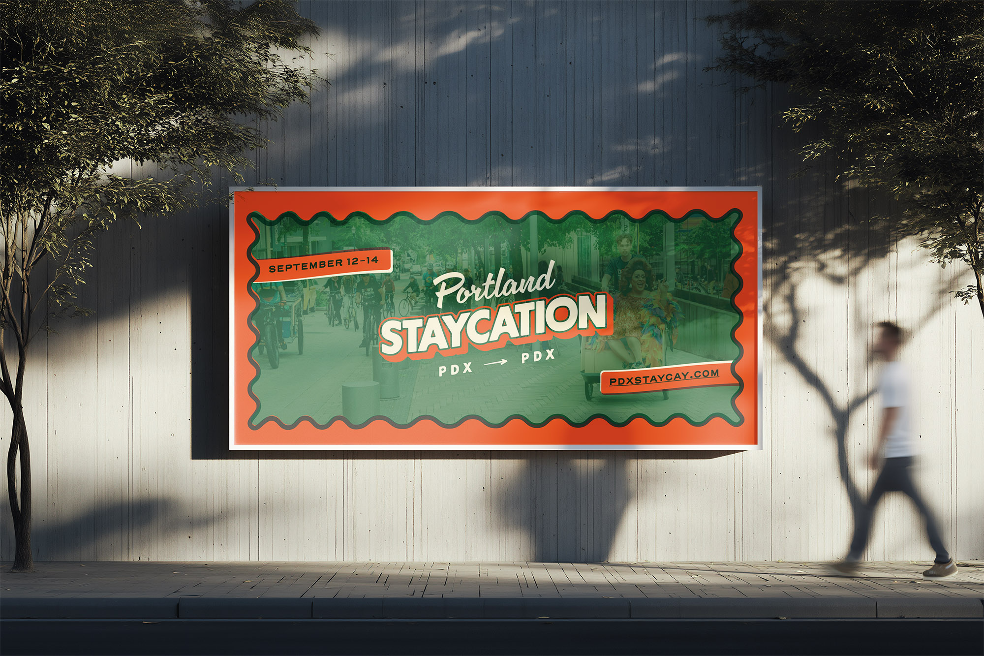
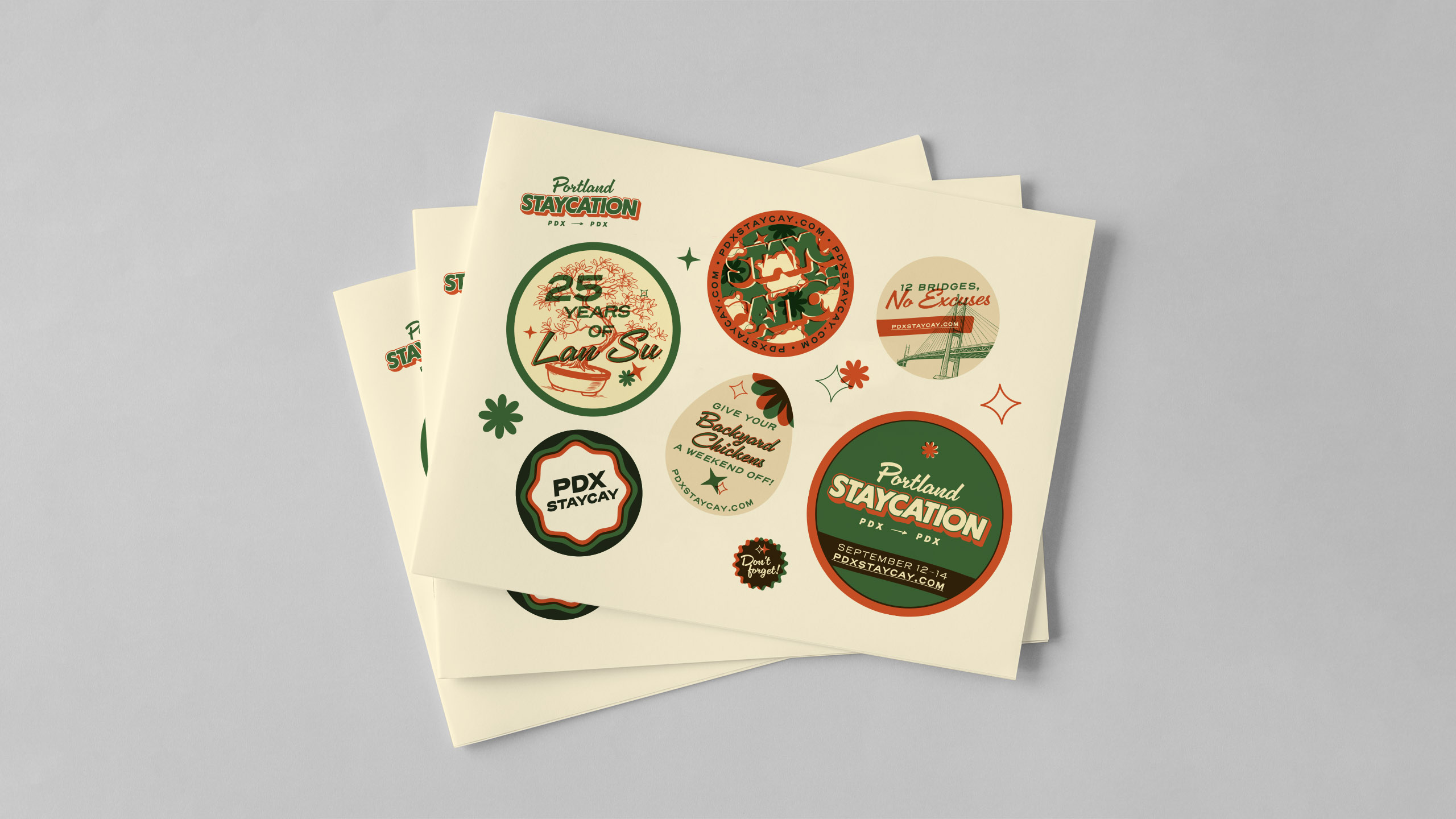
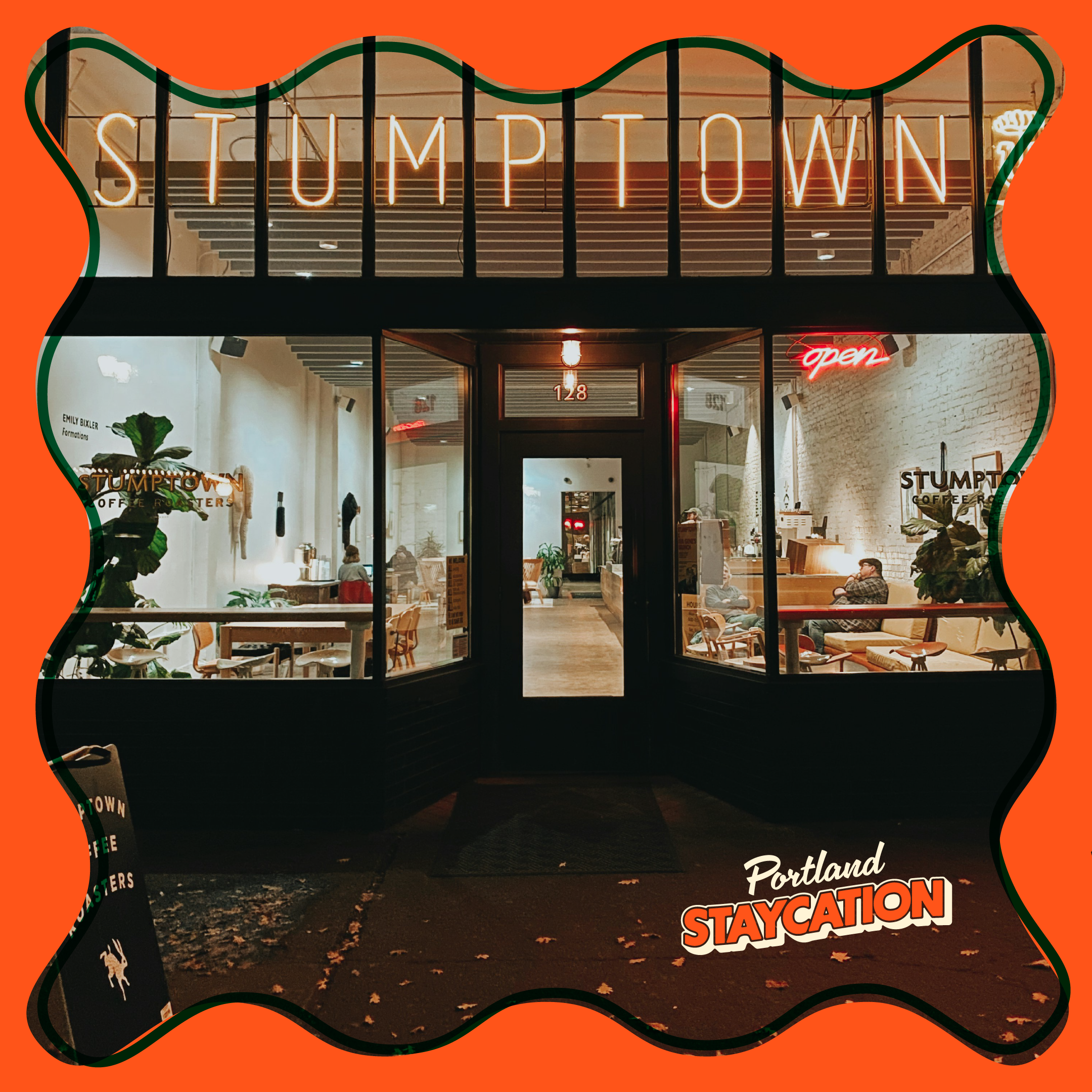
The direction was all about channeling Portland's quirky personality. We combined a fun, mid-century design sensibility with a vintage postcard aesthetic by creating pieces that felt less like ads and more like a natural part of the city. The tone stayed light: welcoming headlines paired with cheeky, Portland-specific one-liners. Yes, even backyard chicken jokes made the cut.
Every detail, designed
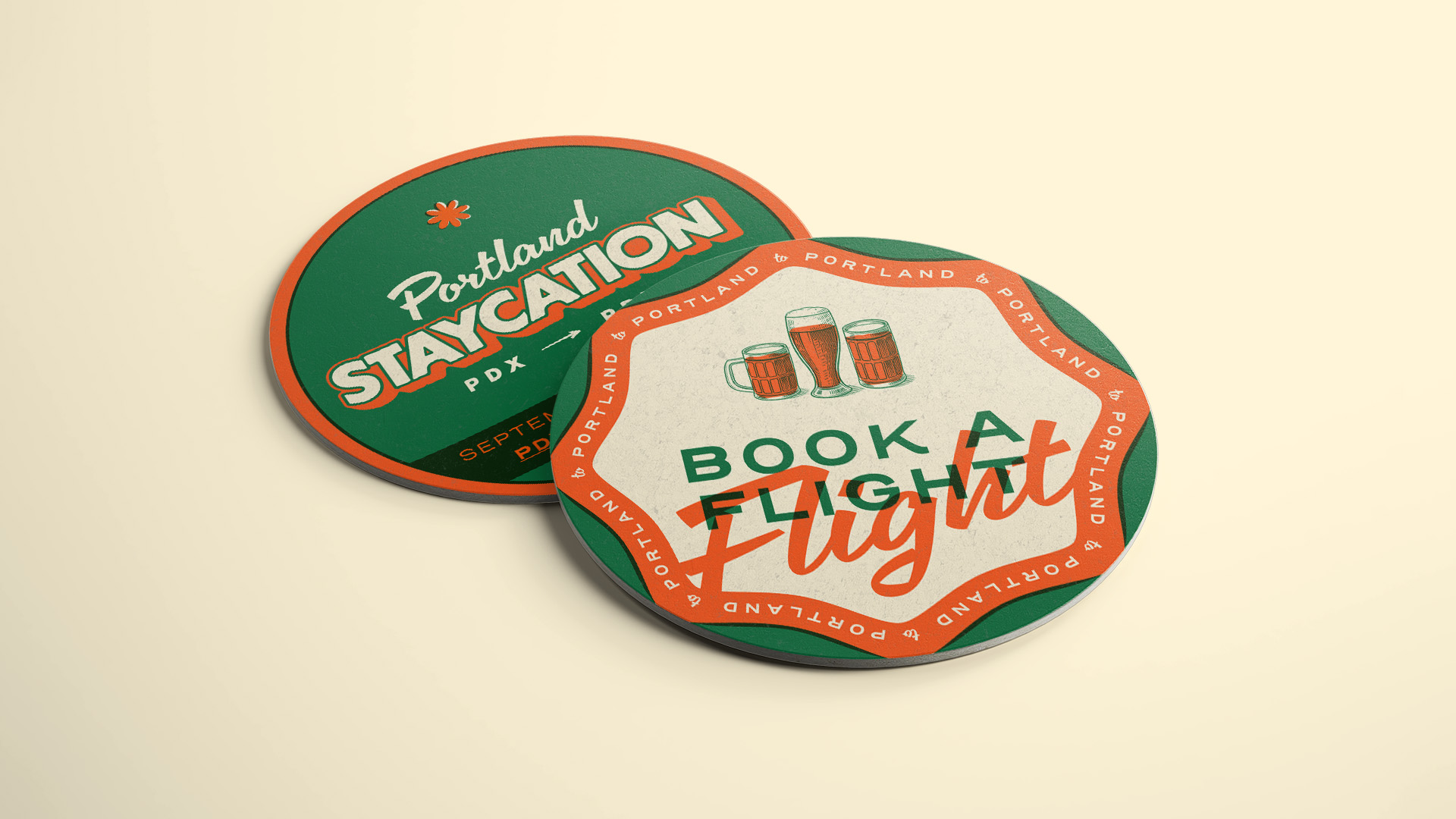
Wear the city
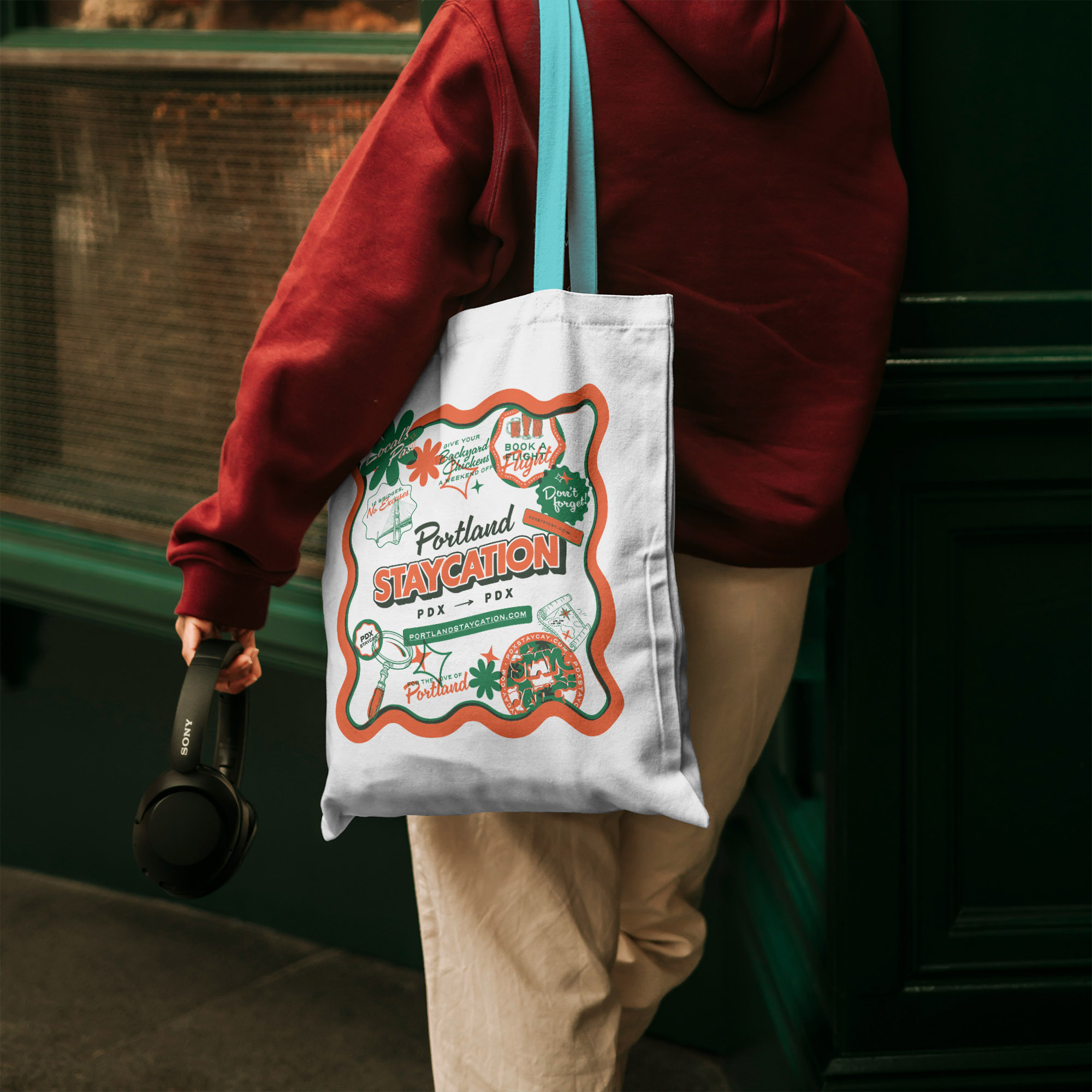
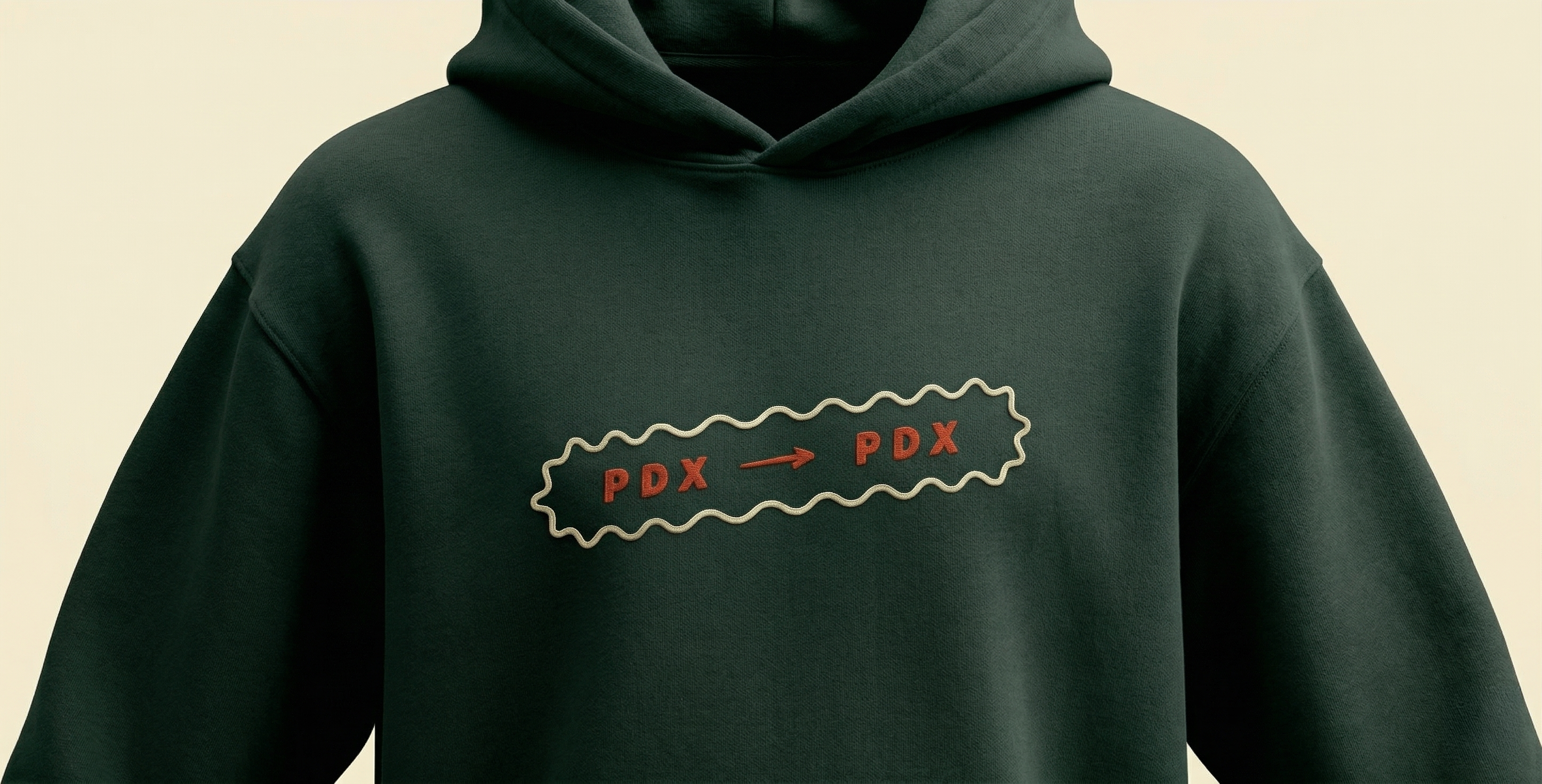
Less like an ad.
More like a part of Portland.

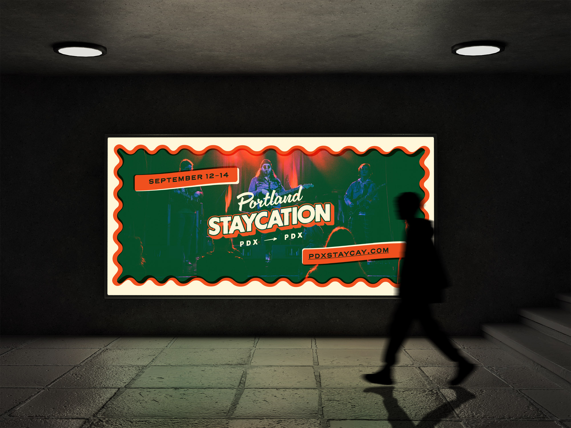
Seen around town
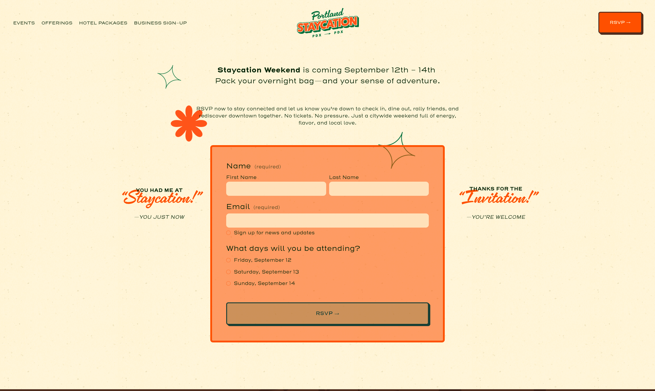
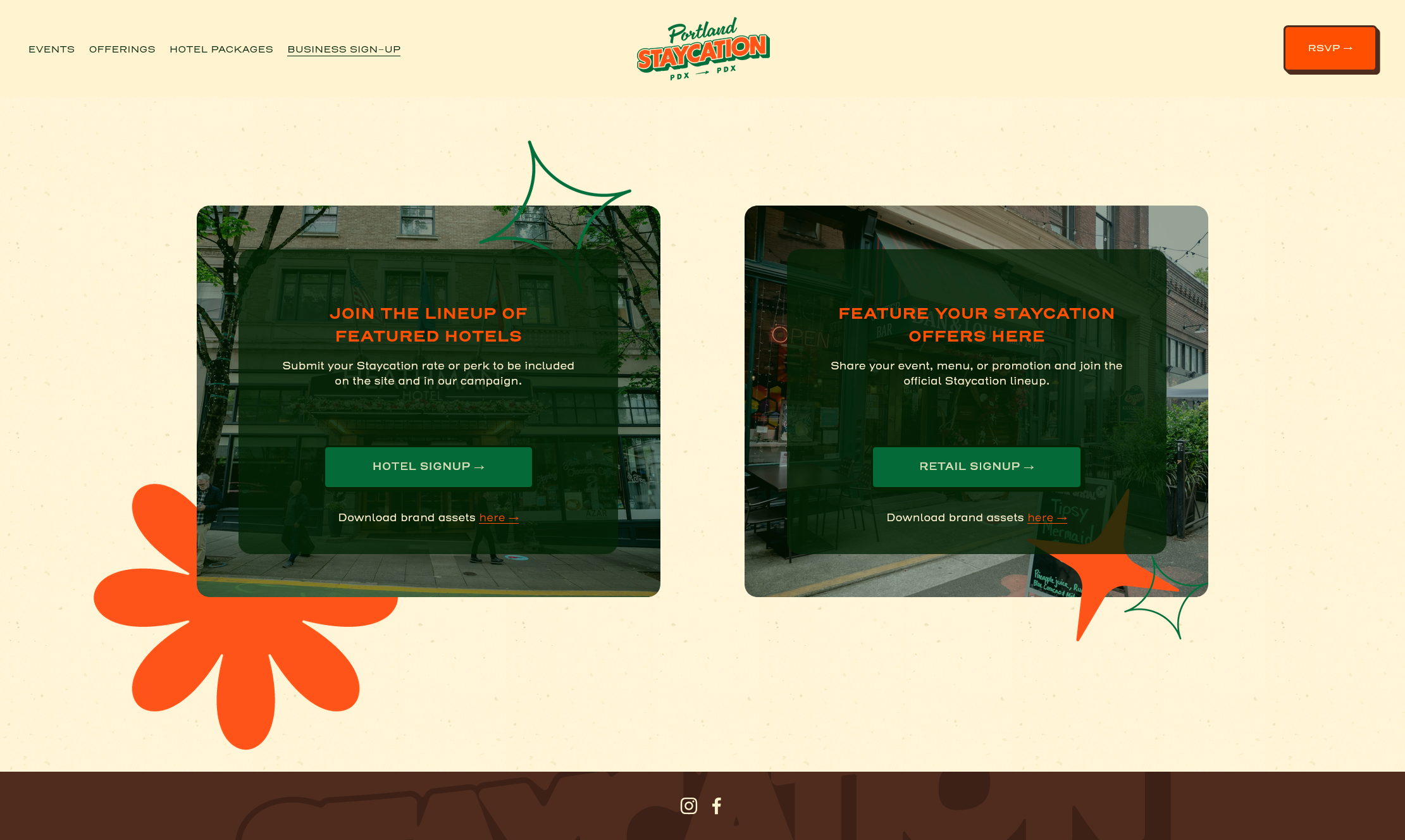
Online presence
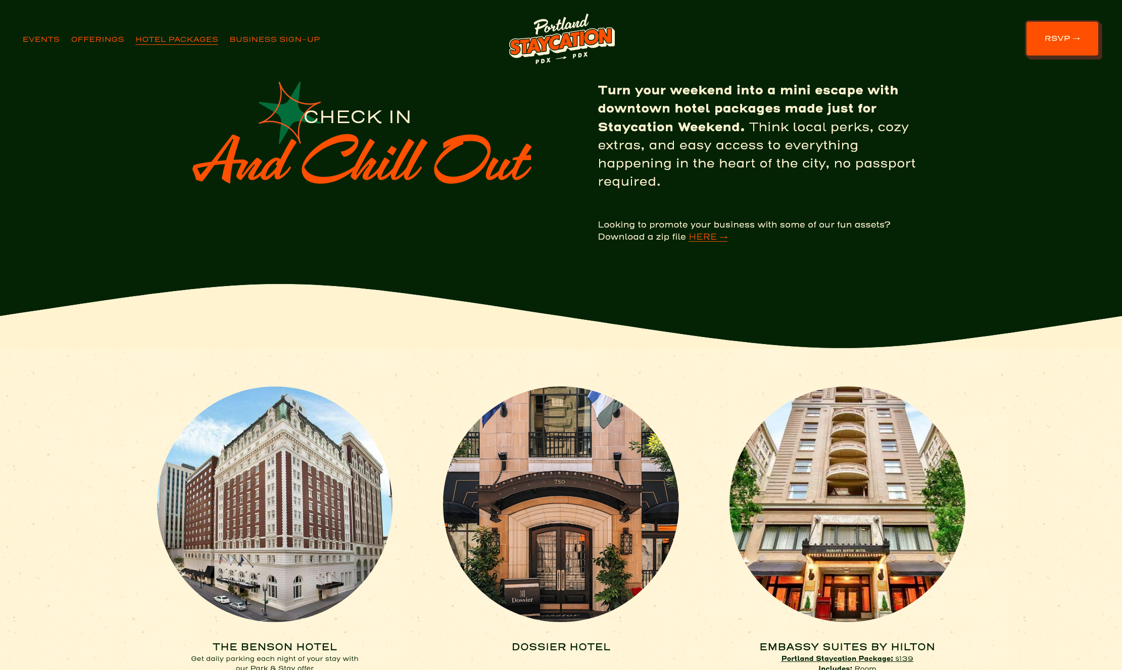
The digital side grew right alongside everything else. A website that's part travel guide, part love letter to the city. Social templates built for sharing. And a run of digital ads for Willamette Week that kept the same postcard warmth at every size.
Built to be shared
The brand's playful personality translated naturally to social. We designed a library of assets for them to use as well as pre-made templates: bold graphics, cheeky one-liners, and Portland-specific moments, all built to stop the scroll and make locals feel like they were in on something.
portland_staycation Your city. Your weekend. Your staycation. 🌲
View all 42 comments


A city to rediscover
As the campaign grew, so did the work. What started as a brand pitch became billboards, social media, print collateral, merchandise, digital advertising, and a dedicated website, all evolving organically as new partners came on board. Portland Staycation became a recognizable presence across the city, driving local hotel bookings and neighborhood business traffic during a traditionally slow season. The campaign's success eventually led to an extension of the project into the Winter!