Case Study
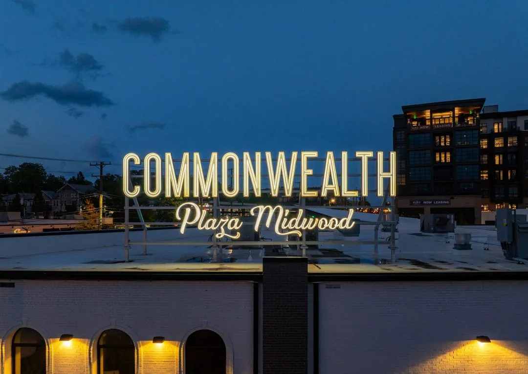
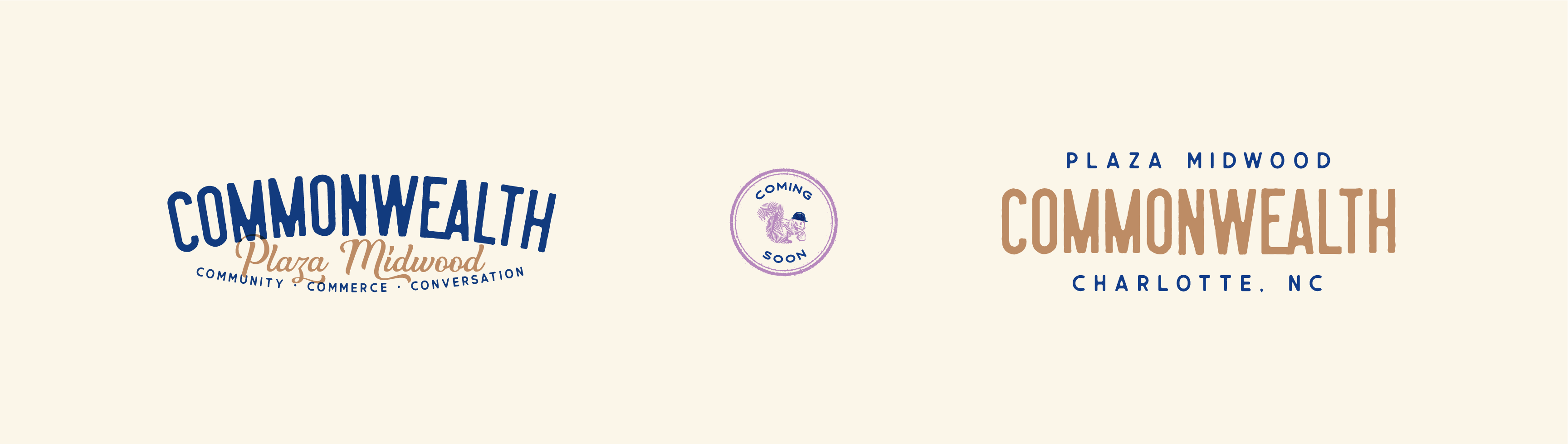
Commonwealth
A neighborhood brand built to feel like it was always there.
Client
Crosland Southeast
Location
Plaza Midwood, Charlotte, NC
Year
2024
Scope
Brand Identity, Visual Language, Signage, Digital
Overview
Part of the neighborhood.
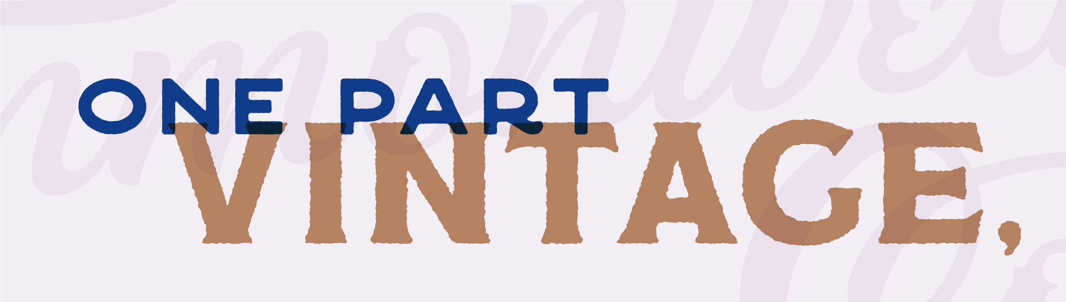
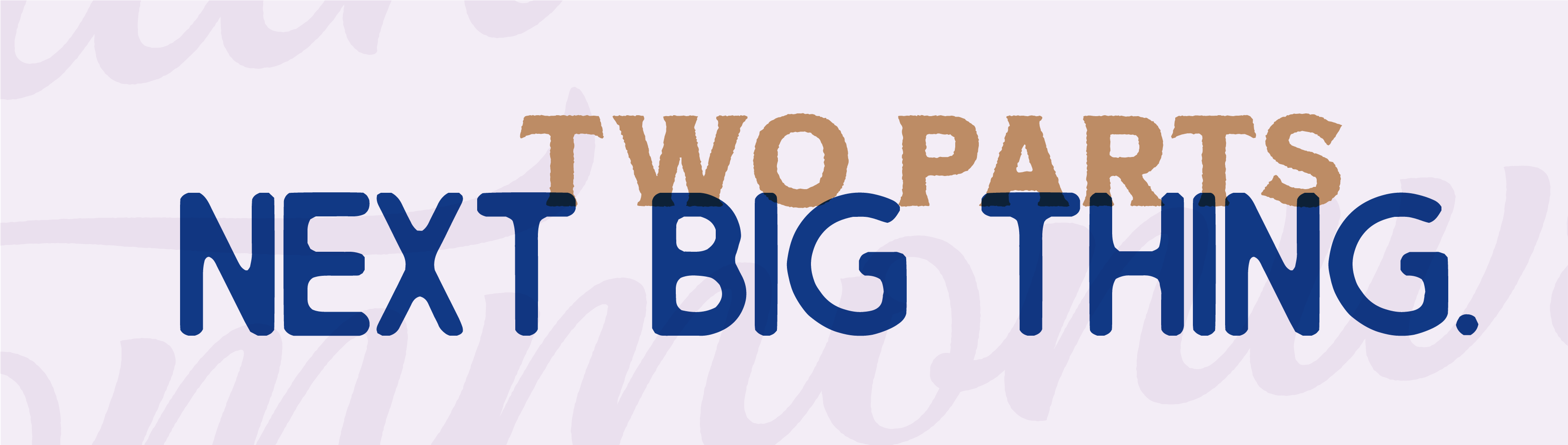
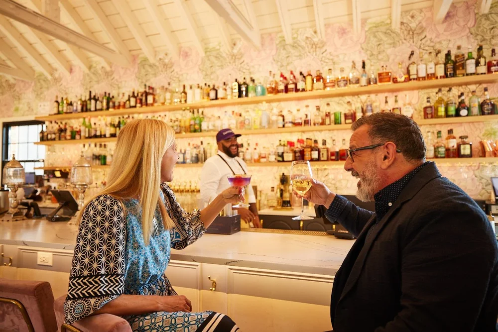
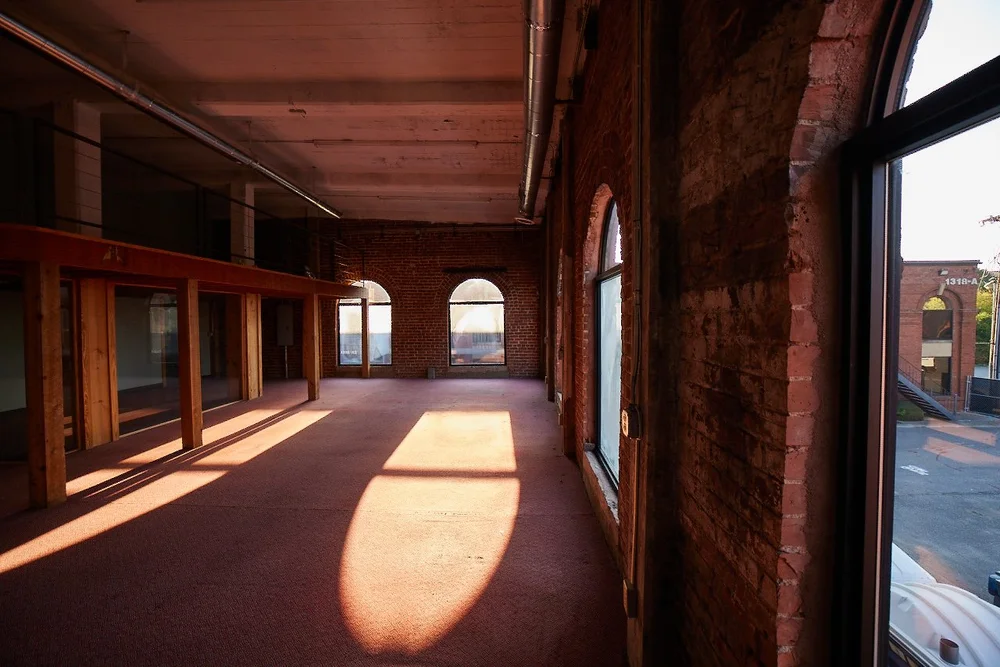
Commonwealth is a new addition to the Plaza Midwood neighborhood of Charlotte. Funky, welcoming, and raw, the brand was designed to feel immediately at home within the area's dynamic energy. The development includes multi-family living, parking, green space, and offices which are all anchored by beautifully restored vintage brick buildings that now host the kind of businesses that give a neighborhood its flavor.
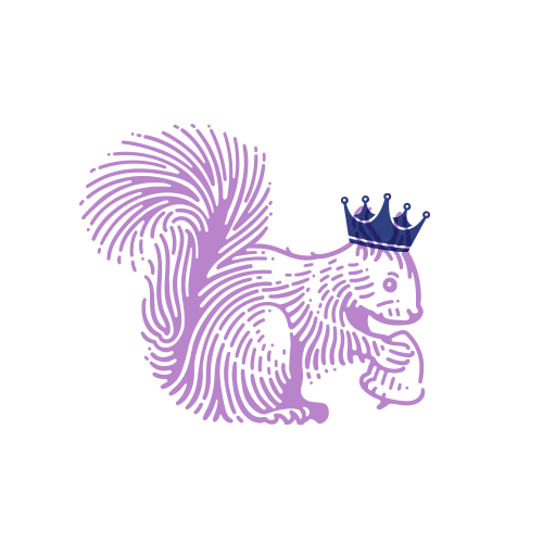
Drawing from its name, I combined a squirrel ('common') with a crown ('wealth,' and a nod to the Queen City) to create the mark. From there, the identity took shape through references to Plaza's industrial rail history, reflected in both color and texture.
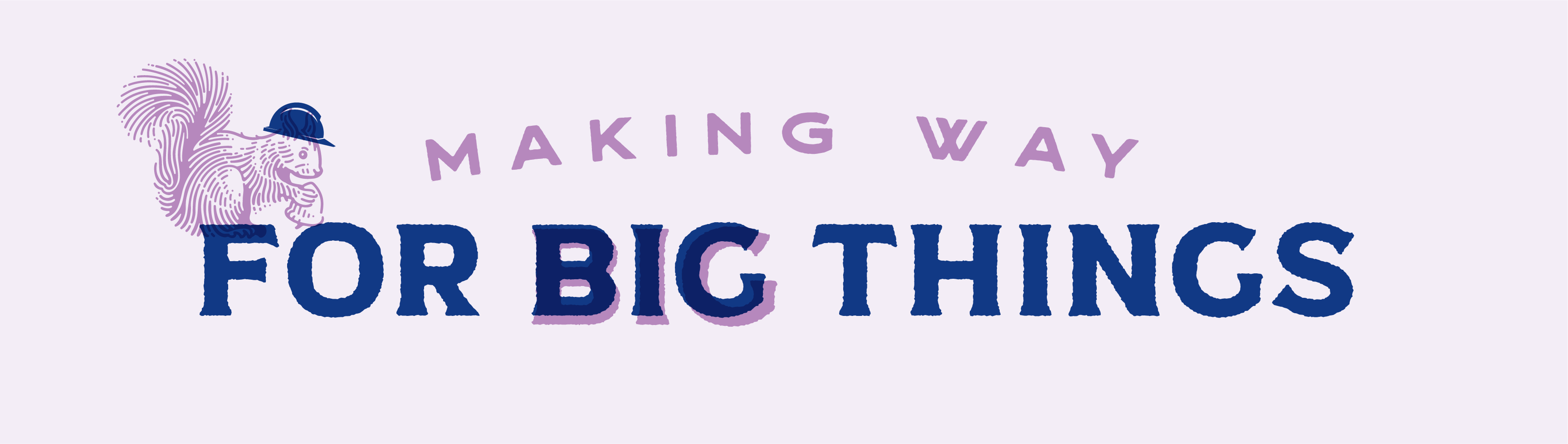
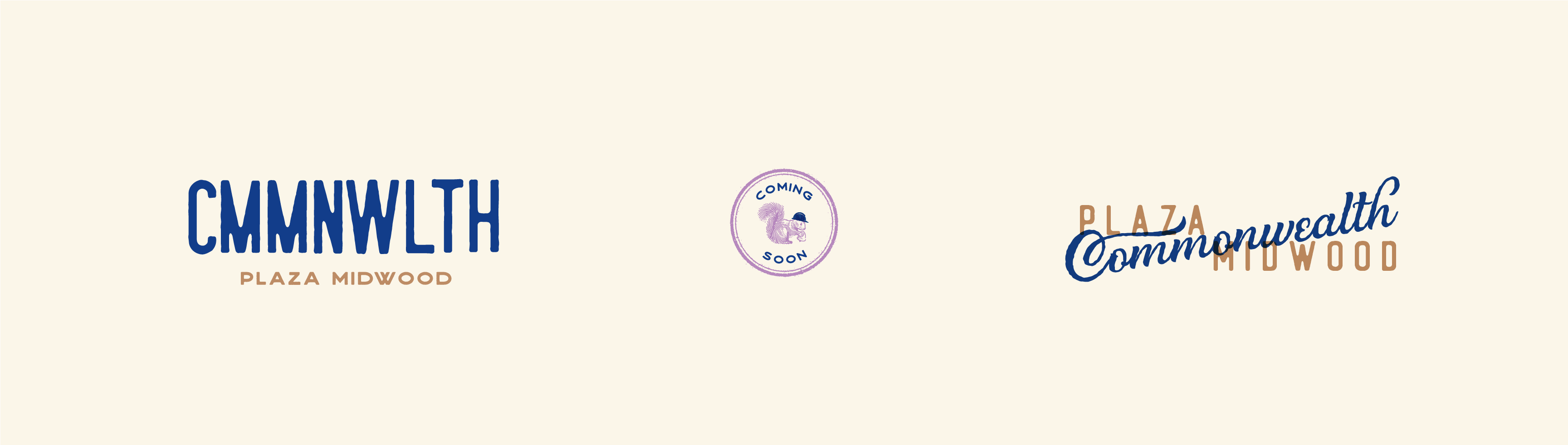
The Mark
Squirrel meets crown.
Identity
A system built to flex.
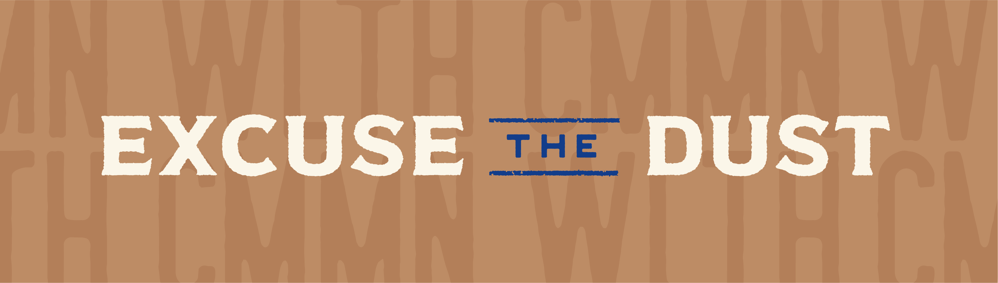
Signage
Fence signage during construction.
The Community
A brand as part of the neighborhood.
Plaza Midwood's culture is rich. Vintage brick, independent shops, and a community that values character and history. Making that existing culture part of the brand was key.
Merch 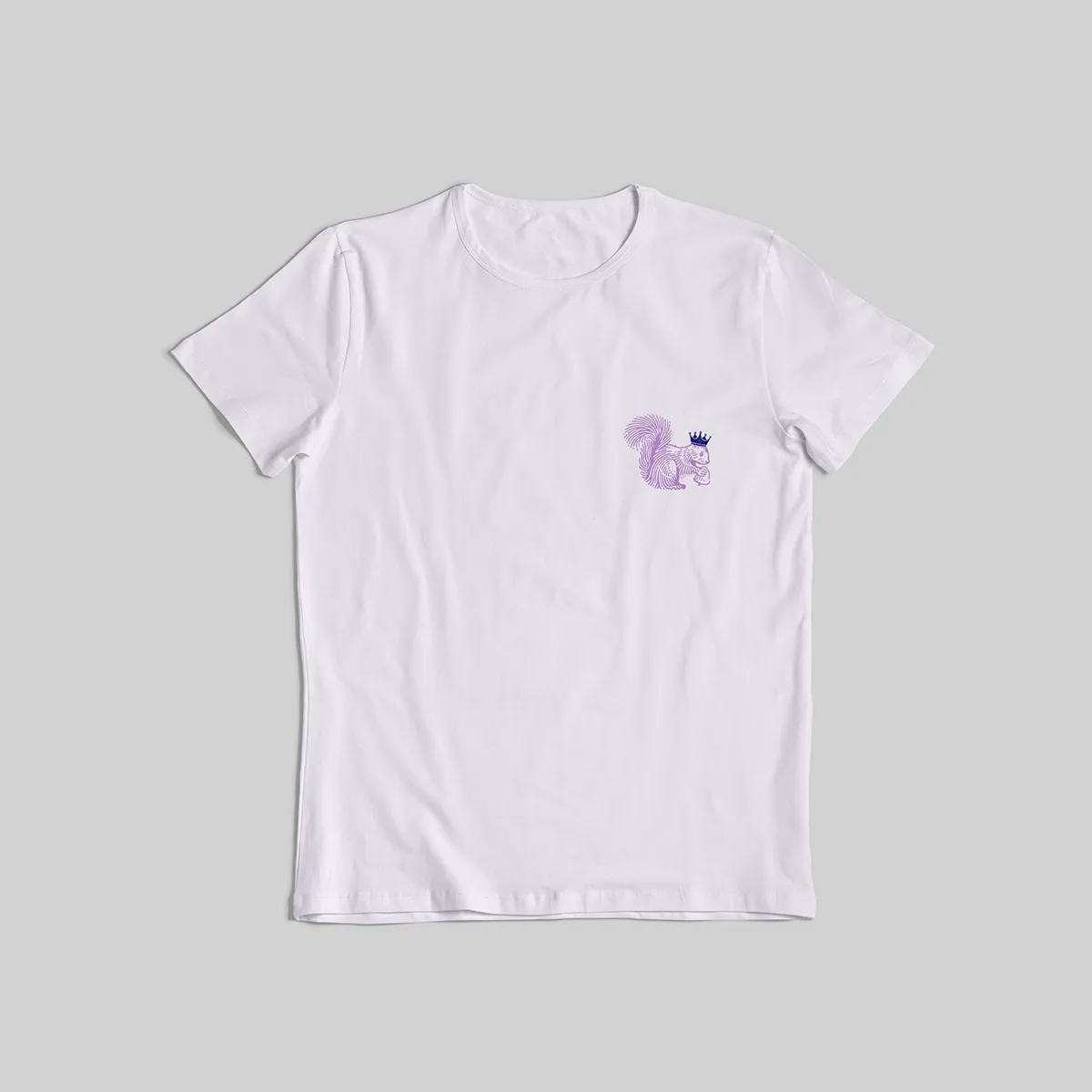
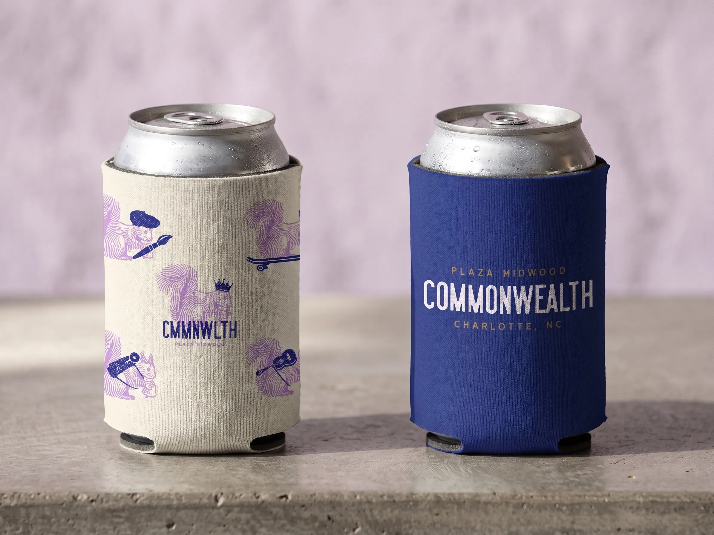
Built to be carried around.
No matter the application, the squirrel is poppin. Scroll to the end for some fun squirrel iterations.
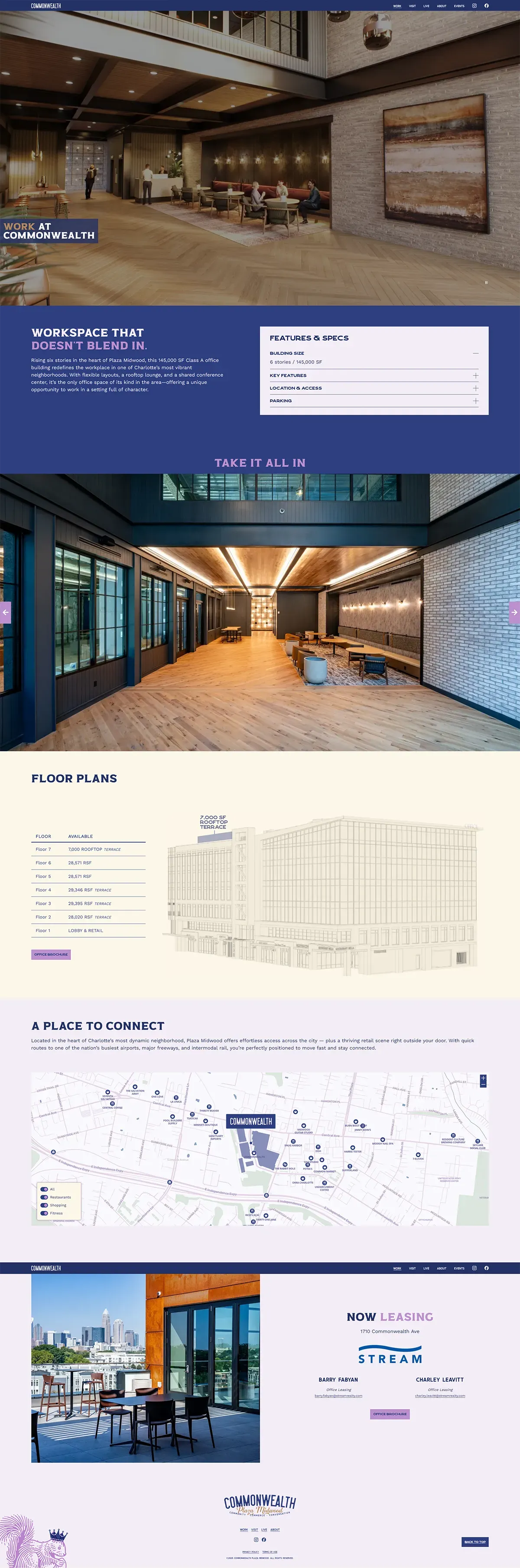
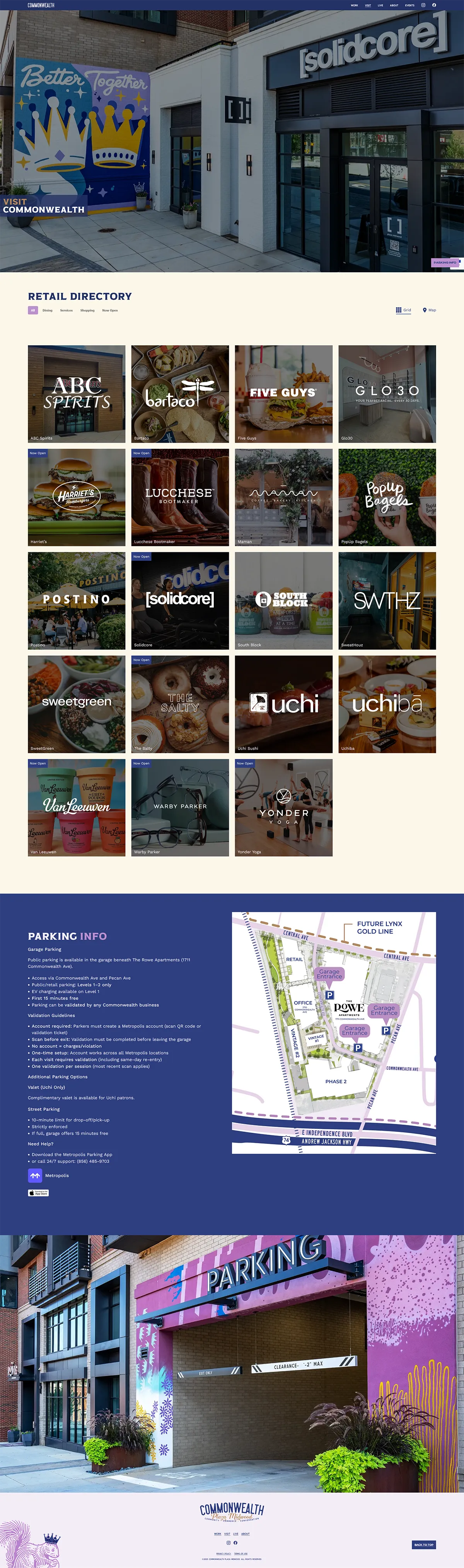
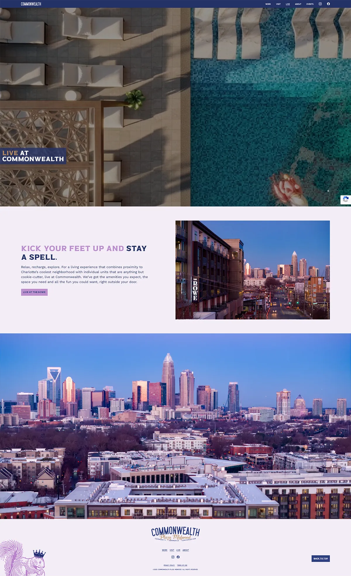
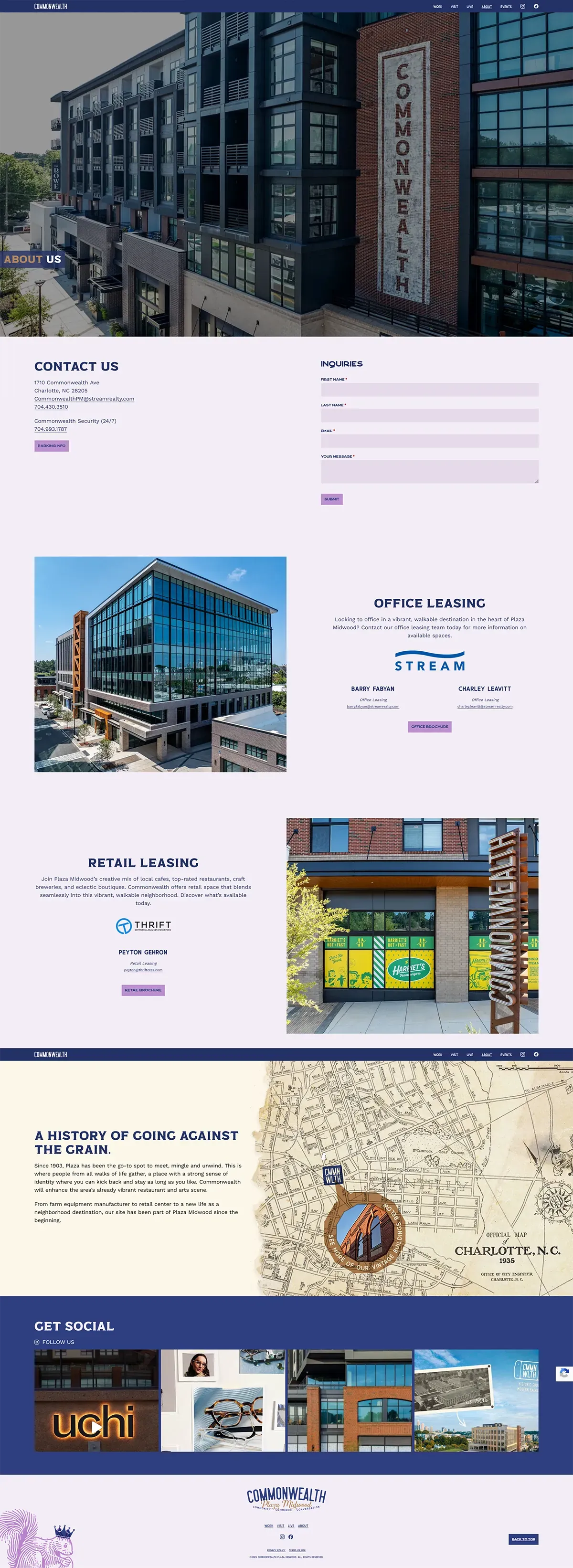
Digital 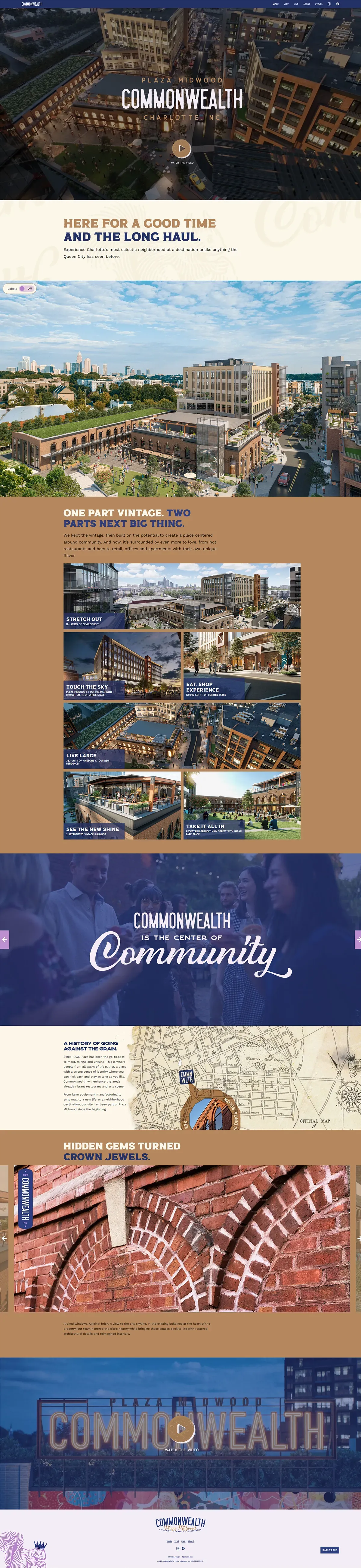
Five pages, one voice.
The website carries the brand's warmth and rawness into every section, built for prospective residents, a business looking for space, or people curious about what's happening in Plaza Midwood.
commonwealthplazamidwood.com
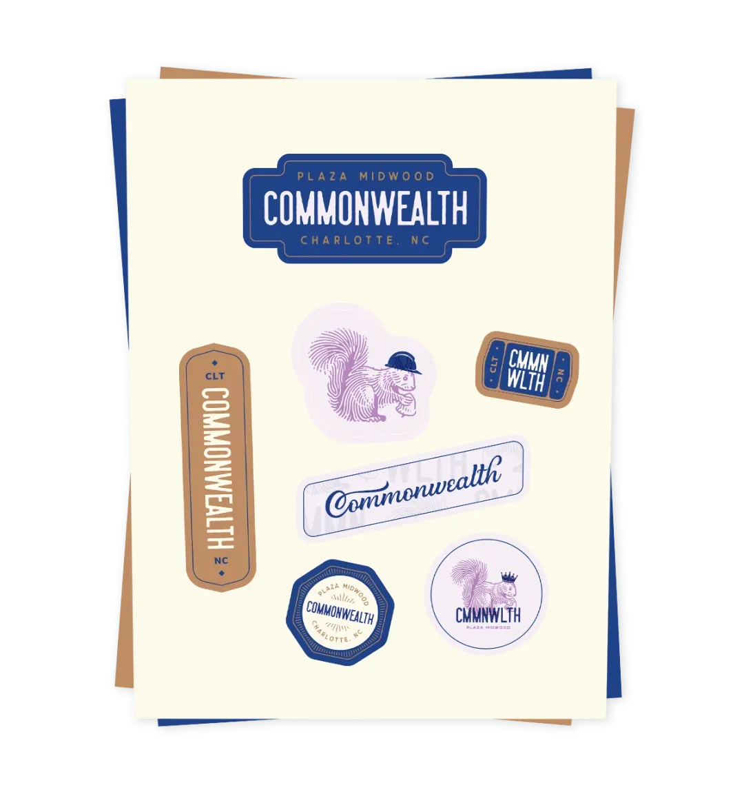
Variations
A squirrel or a chameleon?!
One of the best parts of this brand is how easily the squirrel can perform a costume change.
 Brand
Brand The Approach
At first, there was hesitation about adopting such a playful brand for a large-scale development. But as the brand exploration evolved, so did confidence in the concept. The restored vintage brick buildings on-site now host businesses that add authentic flavor to the community, while the flexible logo system ensures the brand adapts seamlessly to any new venture that arrives.
The squirrel mark was the key that unlocked everything. Once the client saw it fully realized — on signage, on merch, animated — they were sold! The playfulness of the brand felt right at home.